TENENBAUM Law Firm
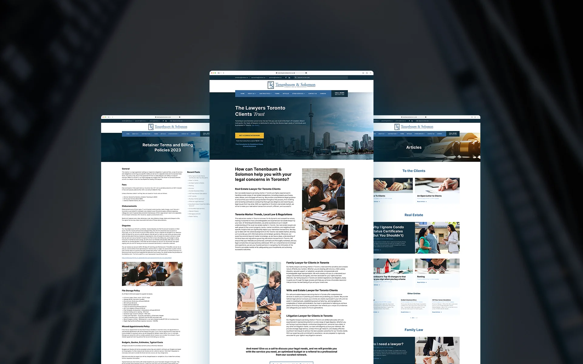
I led the interaction, UI & visual design process of creating a new website for Tenenbaum & Solomon, a leading Canadian law firm specializing in Family Law, Corporate Law, & Real Estate Law. A project focused on enhancing the user experience and increasing customer engagement and conversions through their site.


QUICK SUMMARY
KEY RESPONSIBILITIES
Collaborating closely with the Project Manager, UX Designer, and SEO Specialist to execute the end-to-end design process.
Defining key user flows, a new sitemap, mood boards / creating wireframes, mockups, and prototypes.
Supporting software engineer and the QA through the build and testing process.
DURATION
Sep. 2023 - Dec. 2023
Sep. 2023 - Dec. 2023
role
UX/UI Designer
Interaction Designer
Visual Designer
UX/UI Designer
Interaction Designer
Visual Designer
TEAM
1 x
1 x
1 x
1 x
1 x
1 x
1 x
1 x
1 x
1 x
1 x
1 x
Project Manager
UX Researcher
UX/UI Designer (Me)
SEO Specialist
Copywriter
Software Engineer
Project Manager
UX Researcher
UX/UI Designer (Me)
SEO Specialist
Copywriter
Software Engineer
KEY RESPONSIBILITIES
Collaborating closely with the Project Manager, UX Designer, and SEO Specialist to execute the end-to-end design process.
Defining key user flows, a new sitemap, mood boards / creating wireframes, mockups, and prototypes.
Supporting software engineer and the QA through the build and testing process.
DURATION
Sep. 2023 - Dec. 2023
role
UX/UI Designer
Interaction Designer
Visual Designer
TEAM
1 x
1 x
1 x
1 x
1 x
1 x
Project Manager
UX Researcher
UX/UI Designer (Me)
SEO Specialist
Copywriter
Software Engineer
KEY RESPONSIBILITIES
Collaborating closely with the Project Manager, UX Designer, and SEO Specialist to execute the end-to-end design process.
Defining key user flows, a new sitemap, mood boards / creating wireframes, mockups, and prototypes.
Supporting software engineer and the QA through the build and testing process.
DURATION
Sep. 2023 -
Dec. 2023
role
UX/UI Designer
Interaction Designer
Visual Designer
TEAM
1 x
1 x
1 x
1 x
1 x
1 x
Project Manager
UX Researcher
UX/UI Designer (Me)
SEO Specialist
Copywriter
Software Engineer
THE PROBLEM
Transforming an outdated blog page into a corporate website
Tenenbaum & Solomon, a Canadian Law firm wanted to increase customer engagement and conversions through their website. However their platform seemed more like an outdated blog page than a corporate website, and it had issues related to navigation, usability, UX writing, and the site responsiveness across mobile devices.
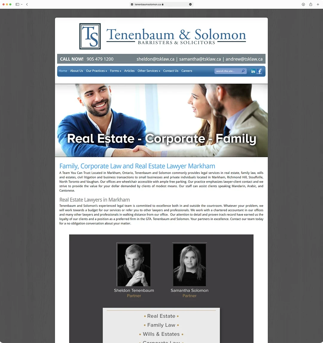


Home page of the original website
Home page of the original website
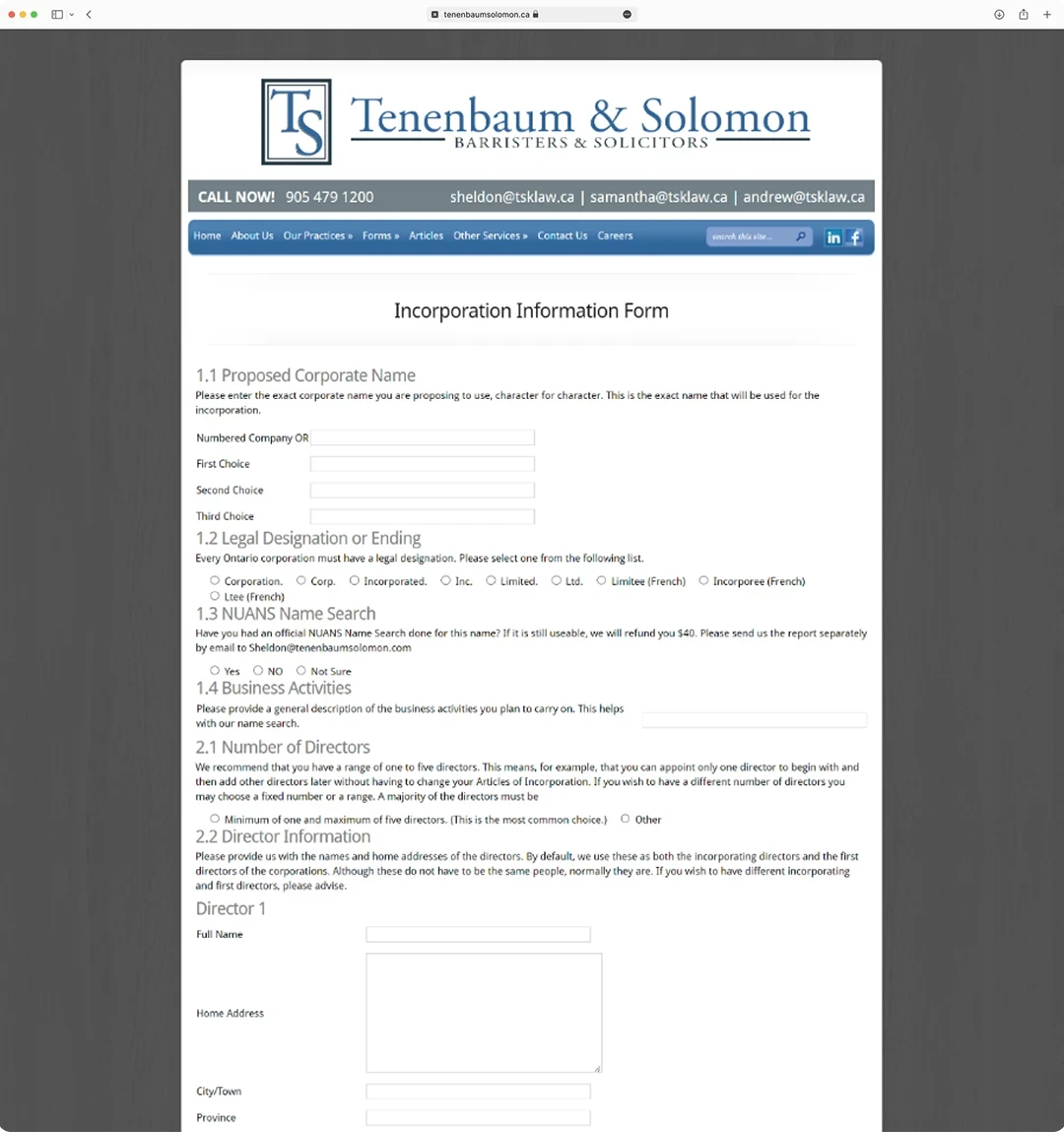


Part of a form page of the original website
Part of a form page of the original website
CHALLENGES
The outdated UI elements across all the pages of the original site were sometimes confusing for users and left the company behind the competition in terms of visual identity and user engagement.
The SEO metrics we gathered from the website shown that only 20% of users ended up contacting the company for an appointment. We identified 4 major challenges that we would have to overcome to create a successful product:
/ Working with a company that had no branding, only a logo.
/ Strategically plan the visual flow to tell the right story to our audience.
/ Creating versatile page layouts to support large amounts of informative content.
/ Optimizing 3 cluttered and visually overwhelming form application pages.
DESIGN PROCESS


We followed a design process based on the Design Thinking framework to help us identify areas for improvement and innovation, develop a clear design strategy, and validate design decisions.
As a first step, we rounded up some key questions to help list out our initial assumptions about our users and the product:
1 - What is the target audience that the company is trying to reach?
2 - What is the main goal of a user looking for legal aid?
3 - What are some examples of successful competitors in the industry?
4 - How can we improve the website to be accessible and easy to use?
DESIGN PROCESS

We followed a design process based on the Design Thinking framework to help us identify areas for improvement and innovation, develop a clear design strategy, and validate design decisions.
As a first step, we rounded up some key questions to help list out our initial assumptions about our users and the product:
1 - What is the target audience that the company is trying to reach?
2 - What is the main goal of a user looking for legal aid?
3 - What are some examples of successful competitors in the industry?
4 - How can we improve the website to be accessible and easy to use?
Research
INSIGHTS
The research phase included user interviews and user testing sessions, these were conducted by the designated UX Researcher, while I made the competitive analysis and a usability audit of the original website. Ultimately we had a meeting with the stakeholders to present the insights gathered from the research.
65% of participants claimed they had mainly used their smartphones when looking for the best attorneys in their areas
65% of participants claimed they had mainly used their smartphones when looking for the best attorneys in their areas
65% of participants claimed they had mainly used their smartphones when looking for the best attorneys in their areas

80% of participants stated that they preferred scheduling an appointment over a phone call instead of an online form
80% of participants stated that they preferred scheduling an appointment over a phone call instead of an online form
80% of participants stated that they preferred scheduling an appointment over a phone call instead of an online form

Participants stated to had searched for law firms only when concerned that they had a legal issue to resolve
Participants stated to had searched for law firms only when concerned that they had a legal issue to resolve
Participants stated to had searched for law firms only when concerned that they had a legal issue to resolve

Most participants stated to look for law firms through online search, instead of going to a legal directory
Most participants stated to look for law firms through online search, instead of going to a legal directory
Most participants stated to look for law firms through online search, instead of going to a legal directory

Reputation, expertise, and testimonials were the main factors considered by participants when deciding between law firms
Reputation, expertise, and testimonials were the main factors considered by participants when deciding between law firms
Reputation, expertise, and testimonials were the main factors considered by participants when deciding between law firms

20% of participants used the search bar on the website to look for their specific legal needs instead of using the navigation links
20% of participants used the search bar on the website to look for their specific legal needs instead of using the navigation links
35% of participants used the search bar on the website to look for their specific legal needs instead of using the navigation links
personas
Understanding our end users
Through a goal-directed process, we emphasized identifying the user's goals before starting our design process. We identified 2 primary personas with the results of the interviews and research, both essential to building an intuitive and efficient experience.
personas
Understanding our end users
Through a goal-directed process, we emphasized identifying the user's goals before starting our design process. We identified 2 primary personas with the results of the interviews and research, both essential to building an intuitive and efficient experience.
personas
Understanding our end users
Through a goal-directed process, we emphasized identifying the user's goals before starting our design process. We identified 2 primary personas with the results of the interviews and research, both essential to building an intuitive and efficient experience.
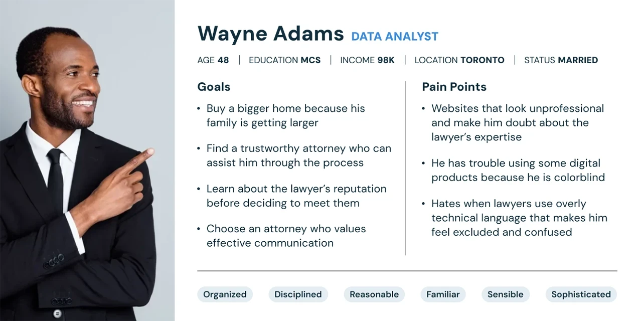

Persona for a user interested in Real Estate Law services
Persona for a user interested in Real Estate Law services

Persona for a user interested in Real Estate Law services

Persona for a user interested in Real Estate Law services
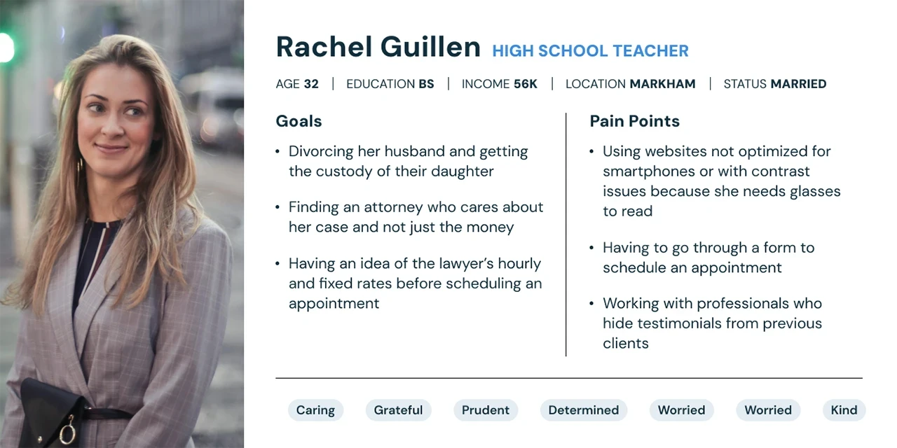

Persona for a user searching for a good Family Lawyer
Persona for a user searching for a good Family Lawyer

Persona for a user searching for a good Family Lawyer

Persona for a user searching for a good Family Lawyer
COMPETITIVE
ANALYSIS
To identify potential areas for improvement, I conducted a competitive analysis of 10 relevant Law Firm websites before beginning the discovery and design phase. By analyzing the layout compositions of their designs and noting common features, I observed how competitors addressed user engagement and the industry trends for UI elements and visual aesthetics. By interacting with the websites, I also evaluated potential areas for improvement and feature changes.
COMPETITIVE ANALYSIS
To identify potential areas for improvement, I conducted a competitive analysis of 10 relevant Law Firm websites before beginning the discovery and design phase. By analyzing the layout compositions of their designs and noting common features, I observed how competitors addressed user engagement and the industry trends for UI elements and visual aesthetics. By interacting with the websites, I also evaluated potential areas for improvement and feature changes.
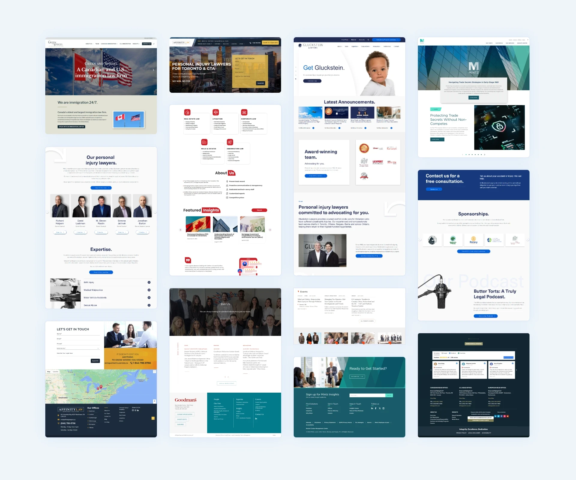


Screenshots of competitor's website for the analysis
Screenshots of competitor's website for the analysis
DISCOVERY
KEY USERFLOWS
I created 2 key user flows to understand how we could ensure a smooth navigation experience for our users. With this, I also aimed to identify the most important pages and UI elements to design first, and from here decide on the overall visual style of the website.
KEY USERFLOWS
I created 2 key user flows to understand how we could ensure a smooth navigation experience for our users. With this, I also aimed to identify the most important pages and UI elements to design first, and from here decide on the overall visual style of the website.
KEY USERFLOWS
I created 2 key user flows to understand how we could ensure a smooth navigation experience for our users. With this, I also aimed to identify the most important pages and UI elements to design first, and from here decide on the overall visual style of the website.
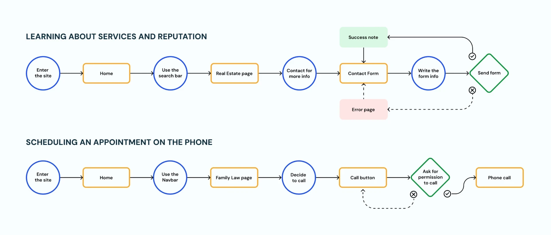


Main user flows in the company's website
Main user flows in the company's website
Sitemap
Fixing a confusing navigation
The usability audit conducted on the website resulted in many navigation issues like a confusing navbar with problems in the dropdown interactions, a search bar that showed random results, and many broken links across the site. To resolve these problems I made the following decisions:
/ Use the “About” tab for reputation, confidentiality, and billing policies
/ Leave the “Our practice” tab only for the main services given by the company
/ Reorganize the articles section by categories and take out all broken links
SITEMAP
Fixing a confusing navigation
The usability audit conducted on the website resulted in many navigation issues like a confusing navbar with problems in the dropdown interactions, a search bar that showed random results, and many broken links across the site. To resolve these problems I made the following decisions:
/ Working with a company that had no branding, only a logo.
/ Creating compelling content with real value for the users.
/ Reorganizing the sitemap due to several broken links.
/ Organizing 3 cluttered and visually overwhelming form application pages.
SITEMAP
Fixing a confusing navigation
The usability audit conducted on the website resulted in many navigation issues like a confusing navbar with problems in the dropdown interactions, a search bar that showed random results, and many broken links across the site. To resolve these problems I made the following decisions:
/ Use the “About” tab for reputation, confidentiality, and billing policies
/ Leave the “Our practice” tab only for the main services given by the company
/ Reorganize the articles section by categories and take out all broken links
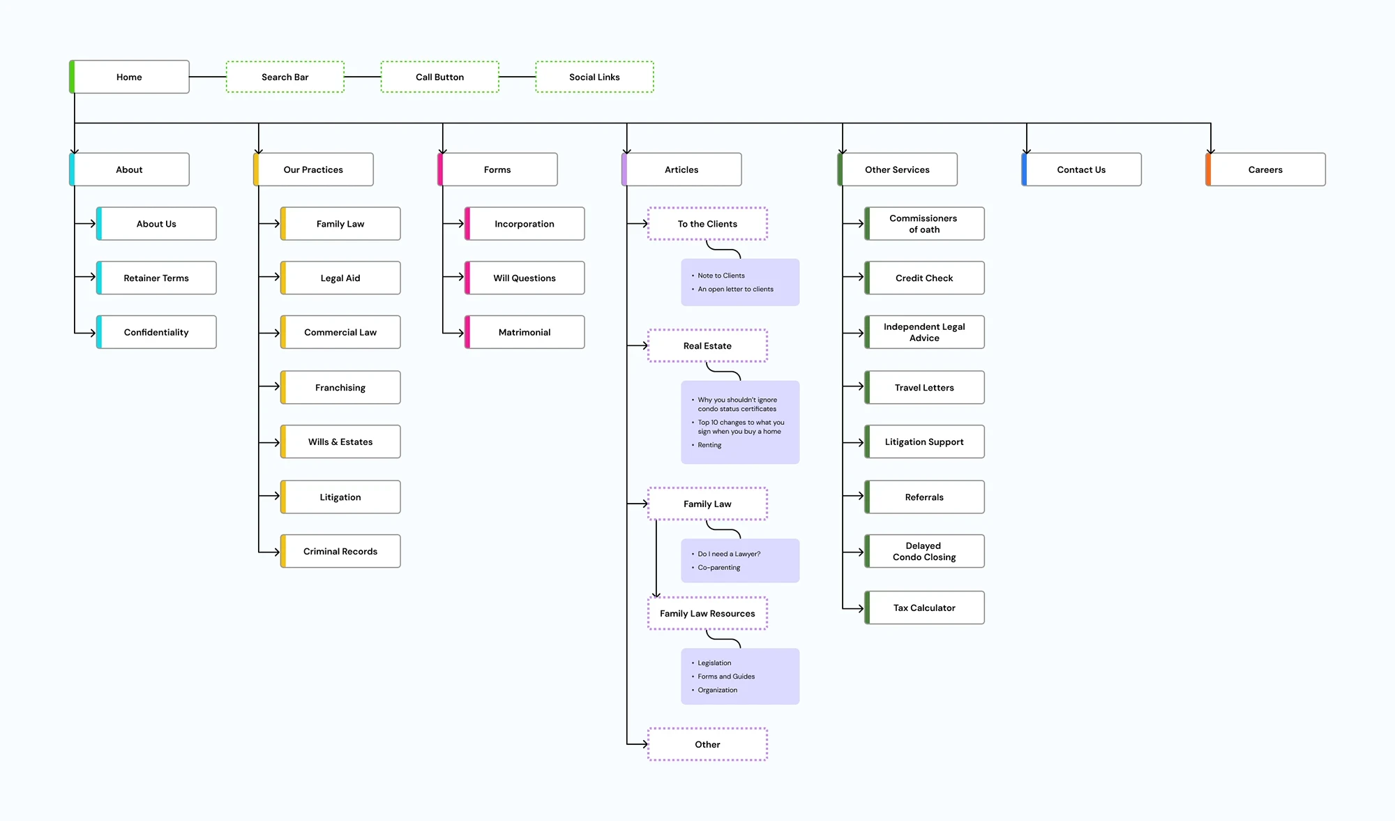


New organization of the sitemap
New organization of the sitemap
Moodboard
Two different types of lawyers
The competitive analysis resulted in valuable insights regarding the visual & brand styles favored by different agencies. We made a wider analysis with renowned Law Firms across Canada and the northern part of the USA, and concluded that Law Firms could be divided into two categories when it comes to brand perception: "Approachable and reliable" or "Sober and sophisticated". After having the discovery session with the client and stakeholders we confirmed that they were interested in a friendlier approach, not a pretentious one.
MOODBOARD
Two different types of lawyers
The competitive analysis resulted in valuable insights regarding the visual & brand styles favored by different agencies. We made a wider analysis with renowned Law Firms across Canada and the northern part of the USA, and concluded that Law Firms could be divided into two categories when it comes to brand perception: "Approachable and reliable" or "Sober and sophisticated". After having the discovery session with the client and stakeholders we confirmed that they were interested in a friendlier approach, not a pretentious one.
moodboard
Two different types of lawyers
The competitive analysis resulted in valuable insights regarding the visual & brand styles favored by different agencies. We made a wider analysis with renowned Law Firms across Canada and the northern part of the USA, and concluded that Law Firms could be divided into two categories when it comes to brand perception: "Approachable and reliable" or "Sober and sophisticated". After having the discovery session with the client and stakeholders we confirmed that they were interested in a friendlier approach, not a pretentious one.
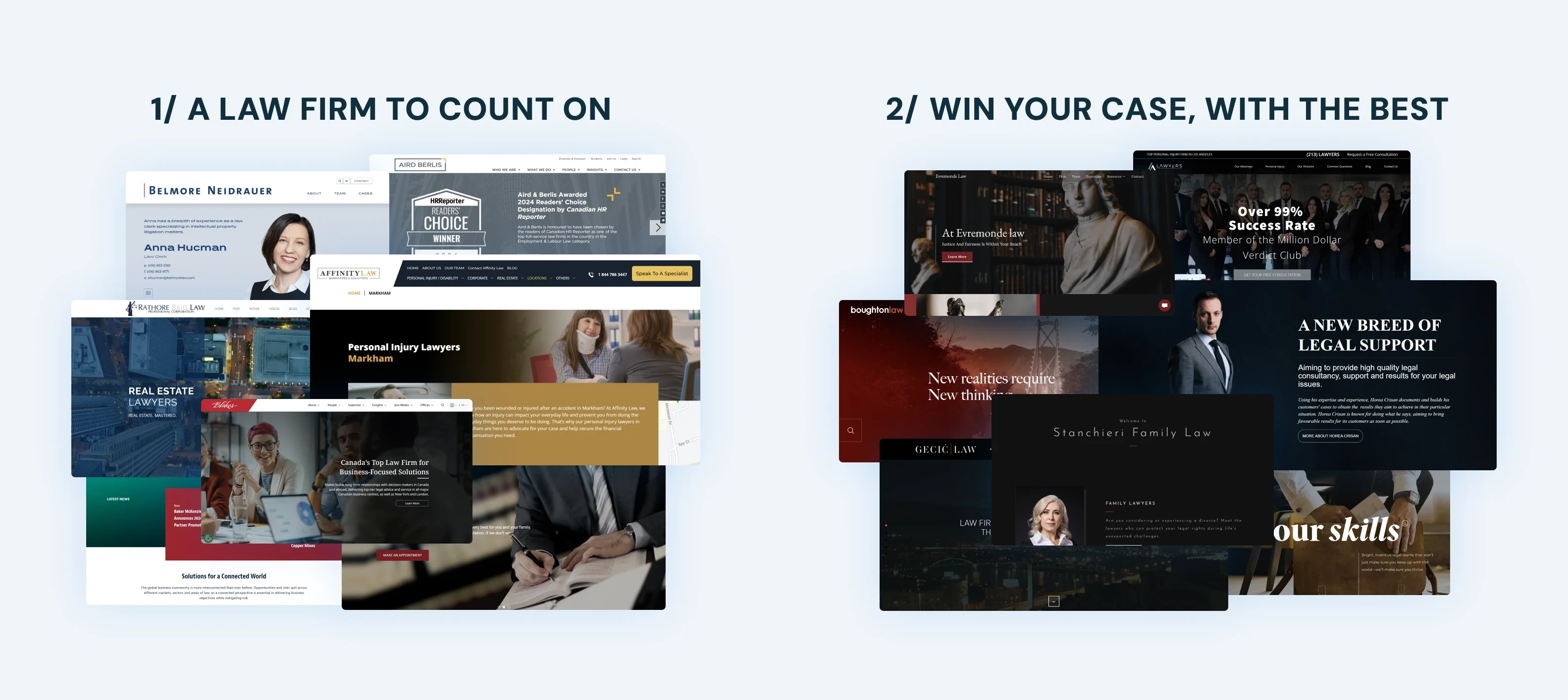


Moodboard selection for the website
Moodboard selection for the website
design
WIREFRAMES
I explored on different wireframe compositions to determine the most effective layout and the necessary functionality, sections, and core UI elements, such as the search bar positioning and design, service cards, product values, and testimonials. After several iterations of the wireframes based on valuable feedback from the stakeholders and the client, we rounded up a solid solution to be used for further visual explorations.
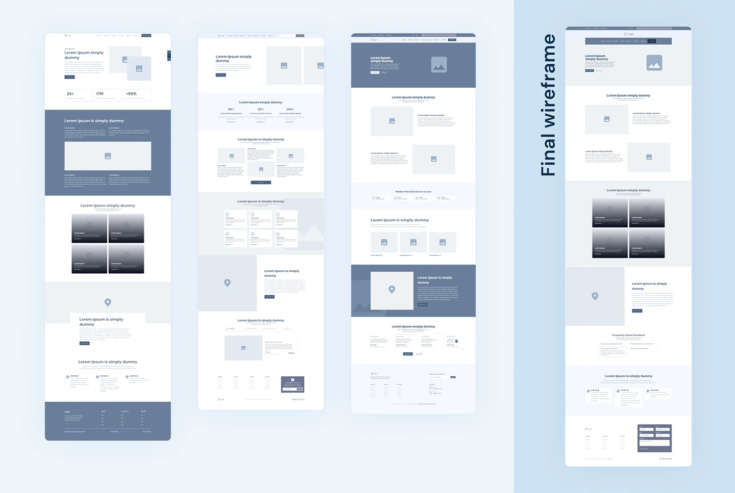


Wireframe exploration for the home page
Wireframe exploration for the home page
HI-FI MOCKUP
I developed a high-fidelity (hi-fi) mockup for the home page by adding the content provided by the copywriter, photos, colors, and typography.
During this stage, I went through various options for color combinations and the best ways to showcase the content. The exploration was limited by several specific requests made by the client but I managed to find a balance between business objectives, user goals, project requirements, and the client's input. I refined some graphics, spacing, and UI layout to improve usability and aesthetics.
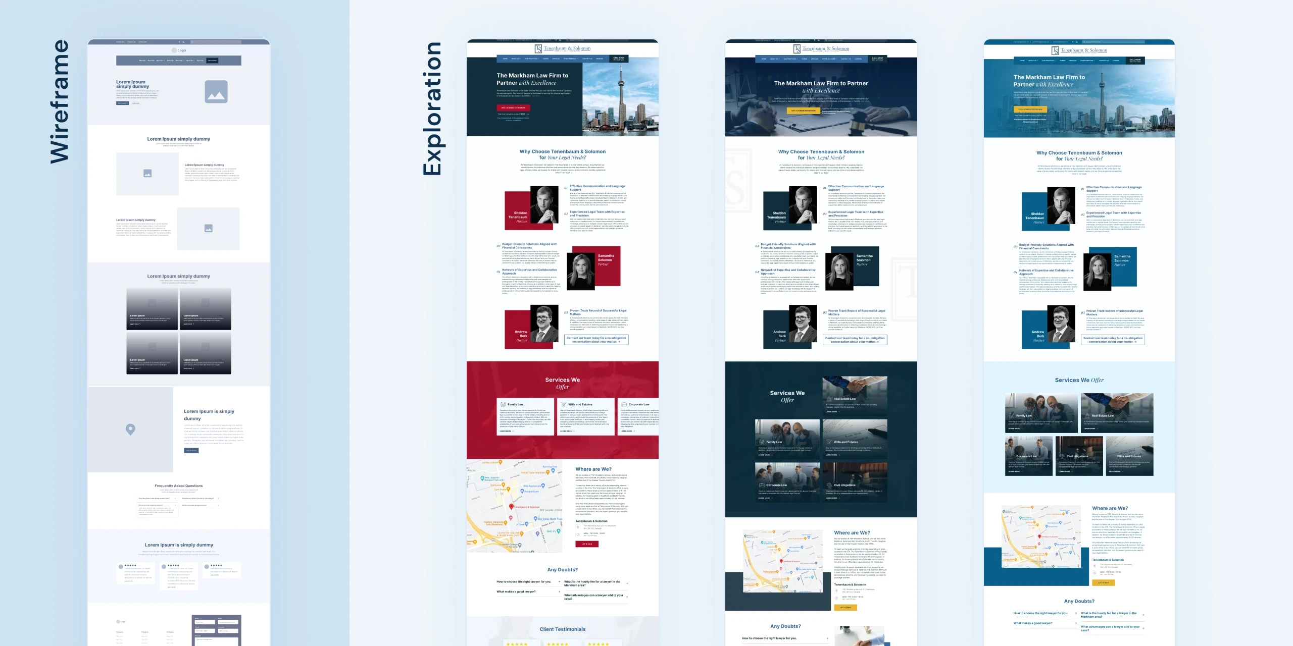


Visual exploration for the homepage hi-fi mockup
Visual exploration for the homepage hi-fi mockup
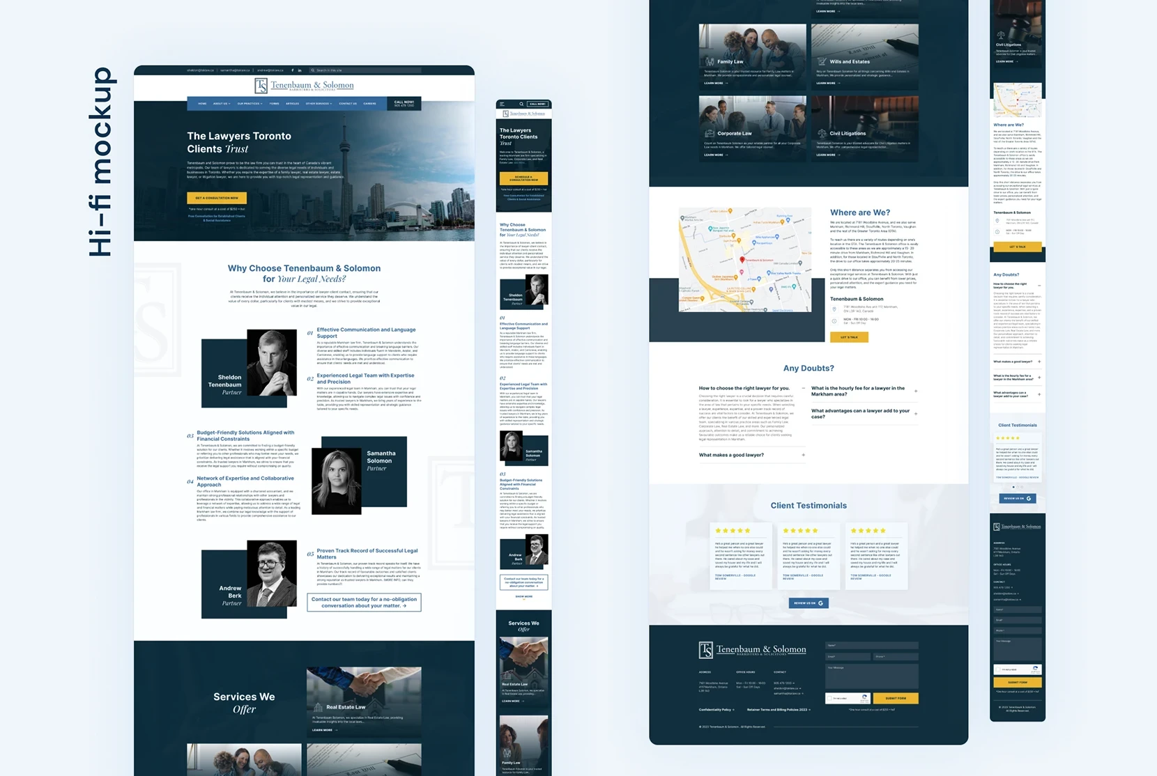


Final high-fidelity mockup of the home page
Final high-fidelity mockup of the home page
Style guide
At this point I started working on a style guide to achieve a consistent and cohesive style for the website. I started with the basic elements and added new components along the way, this was also an important step towards creating a strong foundation for the final design system guidelines.
At this point I started working on a style guide to achieve a consistent and cohesive style for the website.
I started with the basic elements and added new components along the way, this was also an important step towards creating a strong foundation for the final design system guidelines.
Typography
Inter is a geometric sans-serif typeface with a fairly high x-height, making it suitable for both headings and body text to improve readability. This font family also helps to state a clean and minimal feeling without compromising legibility, since it was designed for computer screens and has an outstanding performance.
Colors
The high contrast between blue and the dark neutral as base colors, and yellow as an accent color ensures a correct visual performance and hierarchy for the UI elements in the website. During the exploration, we tried other compositions using red and green, both colors with positive connotations in the law industry, but we ultimately decided to choose blue since it had a perfect synergy with the company's logo and the friendly, yet professional approach.
Iconography
The original website had many inconsistencies regarding icons and graphic elements, therefore we clearly defined the different icon styles and purposes for any future iteration of the website.
Style guide
At this point I started working on a style guide to achieve a consistent and cohesive style for the website. I started with the basic elements and added new components along the way, this was also an important step towards creating a strong foundation for the final design system guidelines.
Typography
Inter is a geometric sans-serif typeface with a fairly high x-height, making it suitable for both headings and body text to improve readability. This font family also helps to state a clean and minimal feeling without compromising legibility, since it was designed for computer screens and has an outstanding performance.
Colors
The high contrast between blue and the dark neutral as base colors, and yellow as an accent color ensures a correct visual performance and hierarchy for the UI elements in the website. During the exploration, we tried other compositions using red and green, both colors with positive connotations in the law industry, but we ultimately decided to choose blue since it had a perfect synergy with the company's logo and the friendly, yet professional approach.
Iconography
The original website had many inconsistencies regarding icons and graphic elements, therefore we clearly defined the different icon styles and purposes for any future iteration of the website.
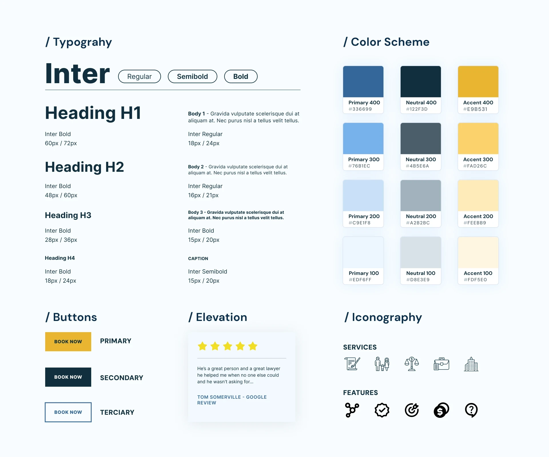


Style guide for designing the website's pages
Style guide for designing the website's pages
PROTOTYPE
INTERFACE
The website had a total of 47 pages, therefore we decided to create different templates based on the homepage design for each category group, to ensure consistency and streamline the workflow of our software engineer with the Elementor CMS. The most important pages on the website were:
Main Services
These pages hold the most important information regarding the main services (Family Law, Corporate Law, Real Estate, Civil Litigation). They are core to the business goals because the content in them is pointed towards achieving conversions, therefore we created a versatile layout, mixing images with large text blocks that were necessary for SEO optimization purposes.
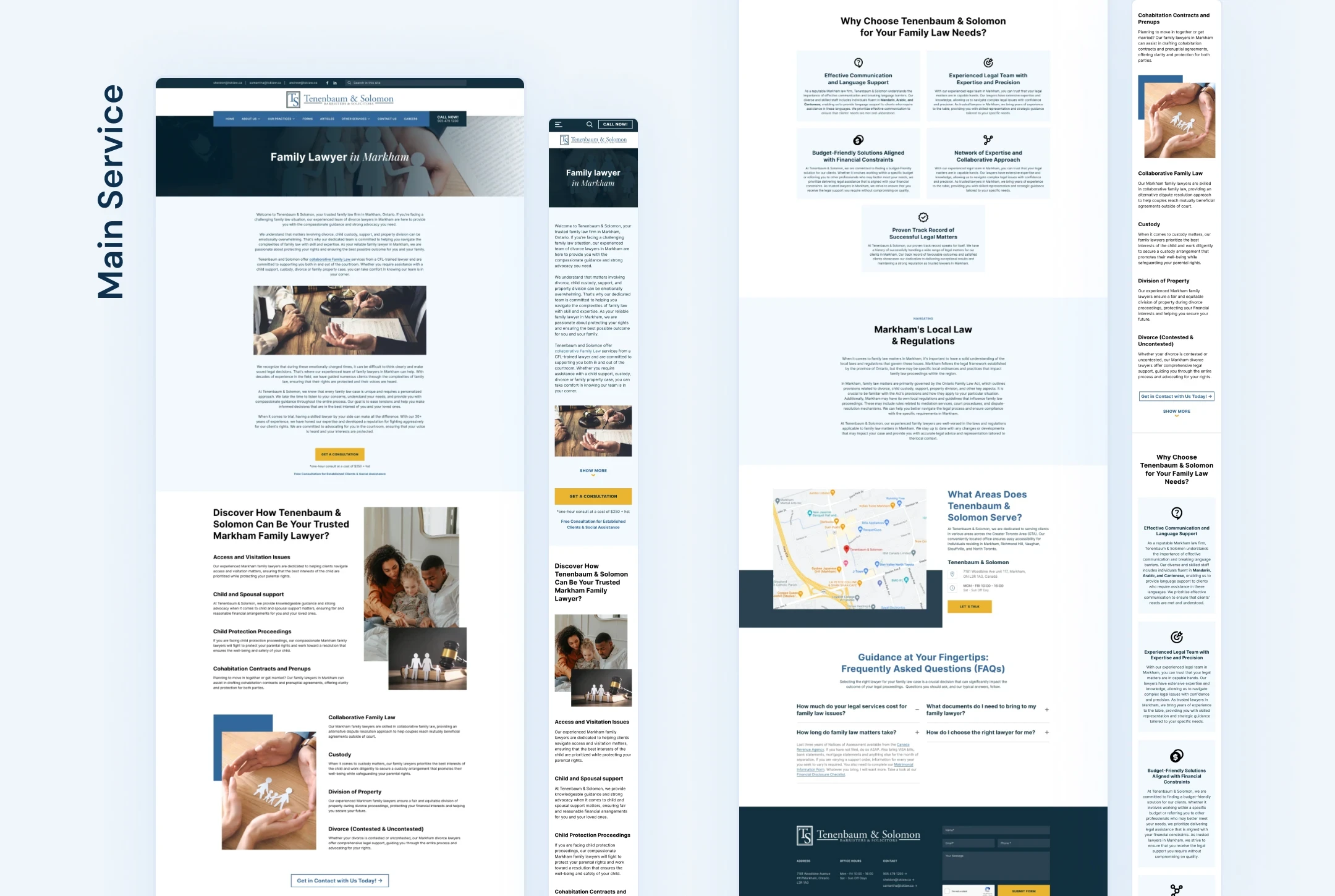


Final hi-fi mockup of one of the main service pages
Final hi-fi mockup of one of the main service pages
Articles Landing Page
The Articles Landing Page needed a layout different from the hone on the homepage, because of this I went through the whole wireframing process again for this specific page. Finally, I decided to use a blog design layout to make it more intuitive and easy to use for the users interested in the company's articles. The articles were grouped by category and then divided into a second hierarchy level based on relevance.
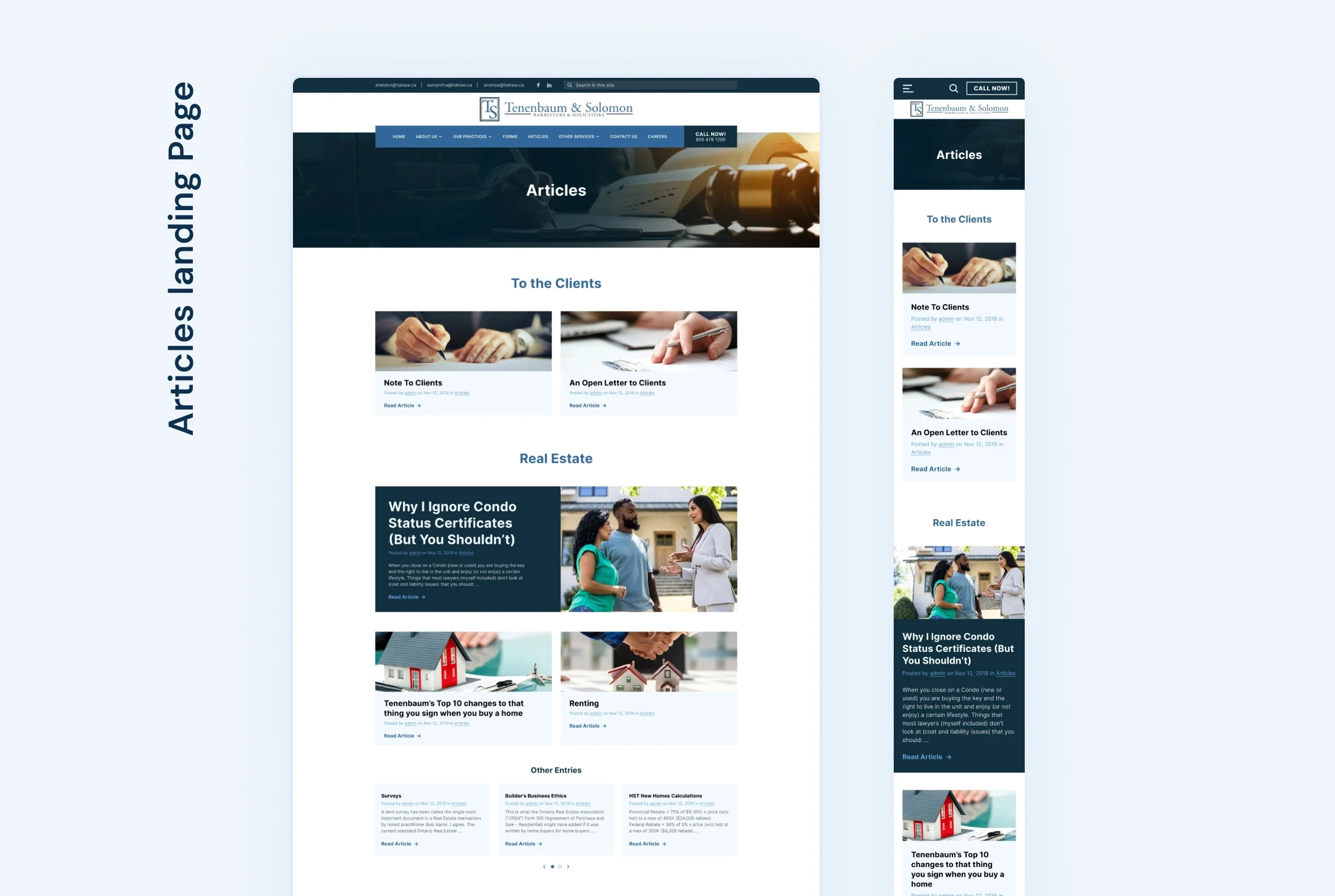


Final hi-fi mockup of the articles landing page
Final hi-fi mockup of the articles landing page
Form Pages
Form pages were a necessary step for all user after they became clients, giving them the option to fill out the information for their case easily from their home. However, the original forms were so poorly organized that they resulted in a pain point for many users. We made a new form layout based on the new website's grid and paid careful attention to the spacing and responsiveness, so the forms were easy to use across any device.


Final hi-fi mockup of one of the form pages
Final hi-fi mockup of one of the form pages
Prototype
Final Product
I used Figma to create an interactive hi-fi prototype, which represents the product closest to the final design in terms of UI components, colors, layouts, and functionalities. This prototype was important for showcasing the results to the stakeholders and the client and giving a visual example of the website's functionality to our software engineer.
Interactive prototype of one of the key user flows
Interactive prototype of one of the key user flows
More Works More Works
More Works More Works
BRANDING
• UX/UI DESIGN
• ADVERTISING •
BRANDING
• UX/UI DESIGN
• ADVERTISING •
BRANDING
• UX/UI DESIGN
• ADVERTISING •

