megaverse CRM
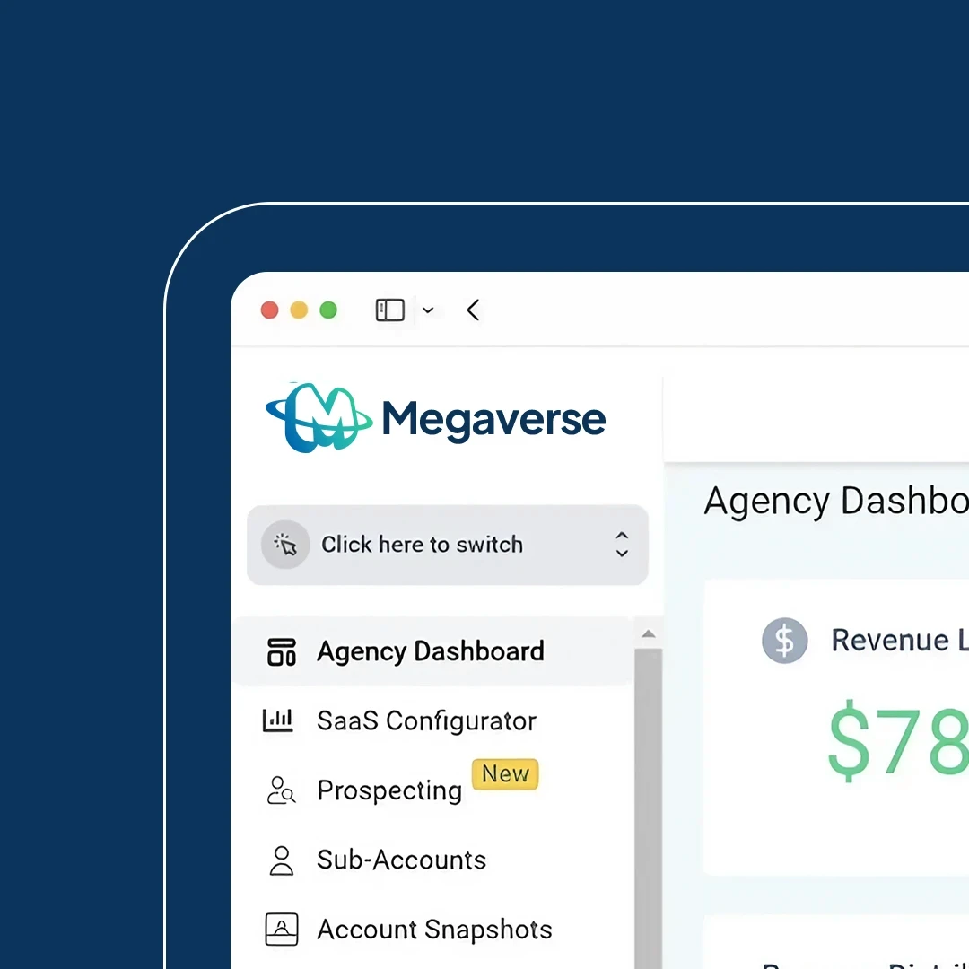
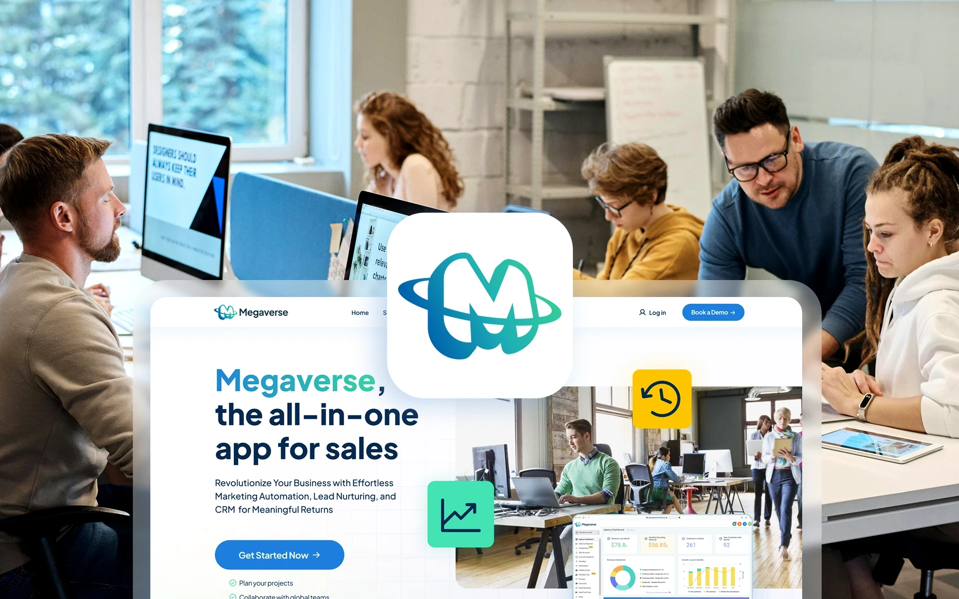
Megaverse, a SaaS Startup in Canada dedicated to providing management solutions for businesses through its CRM app, wanted to redesign its home page to reflect the company's new brand image. This is the second part of a large-scale brand redesign project. To see the first stage of the project use this link.
Client
Megaverse
Year
2024
Category
WEB, Interface
industry
Startup, saas


QUICK SUMMARY
KEY RESPONSIBILITIES
Creating a new homepage design for the company's website to increase conversions and the average session duration.
Collaborating with the brand designer to ensure the redesign was consistent with the new brand guidelines.
Working alongside the junior designer to create a new home / landing page design with a fresh, engaging visual style.
Creating a new homepage design for the company's website to increase conversions and user engagement.
Collaborating with the brand designer to ensure the redesign was consistent with the new brand guidelines.
Working alongside the junior designer to create a new page layout with a fresh and engaging visual style.
DURATION
May 2024
May 2024
role
UI Designer
Visual Designer
Brand Designer
UI Designer
Visual Designer
Brand Designer
TEAM
1 x
1 x
1 x
1 x
1 x
1x
1 x
1 x
1 x
1 x
1 x
1x
Project Manager
Brand Strategist
UI Designer (Me)
Junior Designer
Marketing Specialist
Software Engineer
Project Manager
Brand Strategist
UI Designer (Me)
Junior Designer
Marketing Specialist
Software Engineer
KEY RESPONSIBILITIES
Creating a new homepage design for the company's website to increase conversions and the average session duration.
Collaborating with the brand designer to ensure the redesign was consistent with the new brand guidelines.
Working alongside the junior designer to create a new home / landing page design with a fresh, engaging visual style.
DURATION
May 2024
role
UI Designer
Visual Designer
Brand Designer
TEAM
1 x
1 x
1 x
1 x
1 x
1x
Project Manager
Brand Strategist
UI Designer (Me)
Junior Designer
Marketing Specialist
Software Engineer
Research
Heuristic
Evaluation
As a first approach to creating a new design for the homepage of Megaverse's website, we evaluated the original site, this way we could have a clear view of its problems and how to improve them. For this, we decided to use a variation of the Heuristic Evaluation method by Nielsen Norman but focused on aesthetics, interactivity, and engagement, instead of usability. We took this approach instead of user research because of time constraints, and the fact that the project's goal was more directed towards marketing than user experience.
Heuristic Evaluation
As a first approach to creating a new design for the homepage of Megaverse's website, we evaluated the original site, this way we could have a clear view of its problems and how to improve them. For this, we decided to use a variation of the Heuristic Evaluation method by Nielsen Norman but focused on aesthetics, interactivity, and engagement, instead of usability. We took this approach instead of user research because of time constraints, and the fact that the project's goal was more directed towards marketing than user experience.


Heuristic evaluation done by the UX designer
Heuristic evaluation done by the UX designer
We gathered a group of 6 professionals for the evaluation, 3 of them working on the actual project (brand strategist, junior designer, and me), and other 3 experts we asked for help and their insights for this process (UX designer, marketing specialist, and SEM specialist). We were able to receive valuable feedback from this session and use it as a starting point for our design process.
We gathered a group of 6 professionals for the evaluation, 3 of them working on the actual project (brand strategist, junior designer, and me), and other 3 experts we asked for help and their insights for this process (UX designer, marketing specialist, and SEM specialist). We were able to receive valuable feedback from this session and use it as a starting point for our design process.
We gathered a group of 6 professionals for the evaluation, 3 of them working on the actual project (brand strategist, junior designer, and me), and other 3 experts we asked for help and their insights for this process (UX designer, marketing specialist, and SEM specialist). We were able to receive valuable feedback from this session and use it as a starting point for our design process.
Competitive
ANALYSIS
Besides the heuristic evaluation, I conducted a competitive analysis on 9 other SaaS companies with CRM products, to identify successful UX/UI design cases and effective marketing strategies. While analyzing the structure of their designs I searched for the following features:
The layout used in the home page and the distribution of content on each section.
Amount of interactive components besides buttons and links.
Level of detail on the micro-interactions and whether they provided actual value for the user or were just decoration.
Visual style used by each company on their website.
Consistency with the visual identity guidelines of the brand.
Competitive ANALYSIS
Besides the heuristic evaluation, I conducted a competitive analysis on 9 other SaaS companies with CRM products, to identify successful UX/UI design cases and effective marketing strategies. While analyzing the structure of their designs I searched for the following features:
The layout used in the home page and the distribution of content on each section.
Amount of interactive components besides buttons and links.
Level of detail on the micro-interactions and whether they provided actual value for the user or were just decoration.
Visual style used by each company on their website.
Consistency with the visual identity guidelines of the brand.


A section of the competitive analysis
Insights
The problem
Megaverse's current homepage and overall website design are not on the same level as its competition because of several aspects, like a generic visual style, the lack of interactive components, and the use of basic marketing strategies without a clear storytelling or value proposition. However the company has achieved considerable growth and part of it through website conversions, so we decided to take into account the positive decisions made by the previous design team.
INSIGHTS
The problem
Megaverse's current homepage and overall website design are not on the same level as its competition because of several aspects, like a generic visual style, the lack of interactive components, and the use of basic marketing strategies without a clear storytelling or value proposition. However the company has achieved considerable growth and part of it through website conversions, so we decided to take into account the positive decisions made by the previous design team.
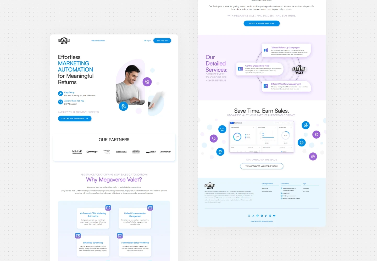


Current homepage of the company's website
Current homepage of the company's website
The positive
The homepage has a clean design, it is not cluttered with information.
The mix of screenshots from the app to show functionality and images of people is a good decision as a supporting graphic element.
Clear CTA buttons across the page.
The negative
Even though the design is clean it feels empty and generic overall compared to the homepage of the different competitors.
There is almost no use of interactive components besides the CTA buttons to enhance the visual journey.
No clear storytelling to engage the user and place Megaverse as the solution to their business needs.
Evident difference in terms of brand maturity and development compared to the competition.
What to improve
Create a design layout that represents the new vibrant brand of Megaverse, with interactive components that show/hide content and guide the user in visual storytelling about the benefits of our product for their sale workflow and the continuous growth of their business as a whole.
DESIGN
Wireframe
A foundation for the visual exploration
Based on the results from the research phase I created a basic wireframe to determine the necessary functionalities and content, serving as the foundation for the page structure. After sharing the initial structure with stakeholders to gather feedback we all decided not to spend time on refinements at this stage and directly dive into the visual style exploration of the homepage
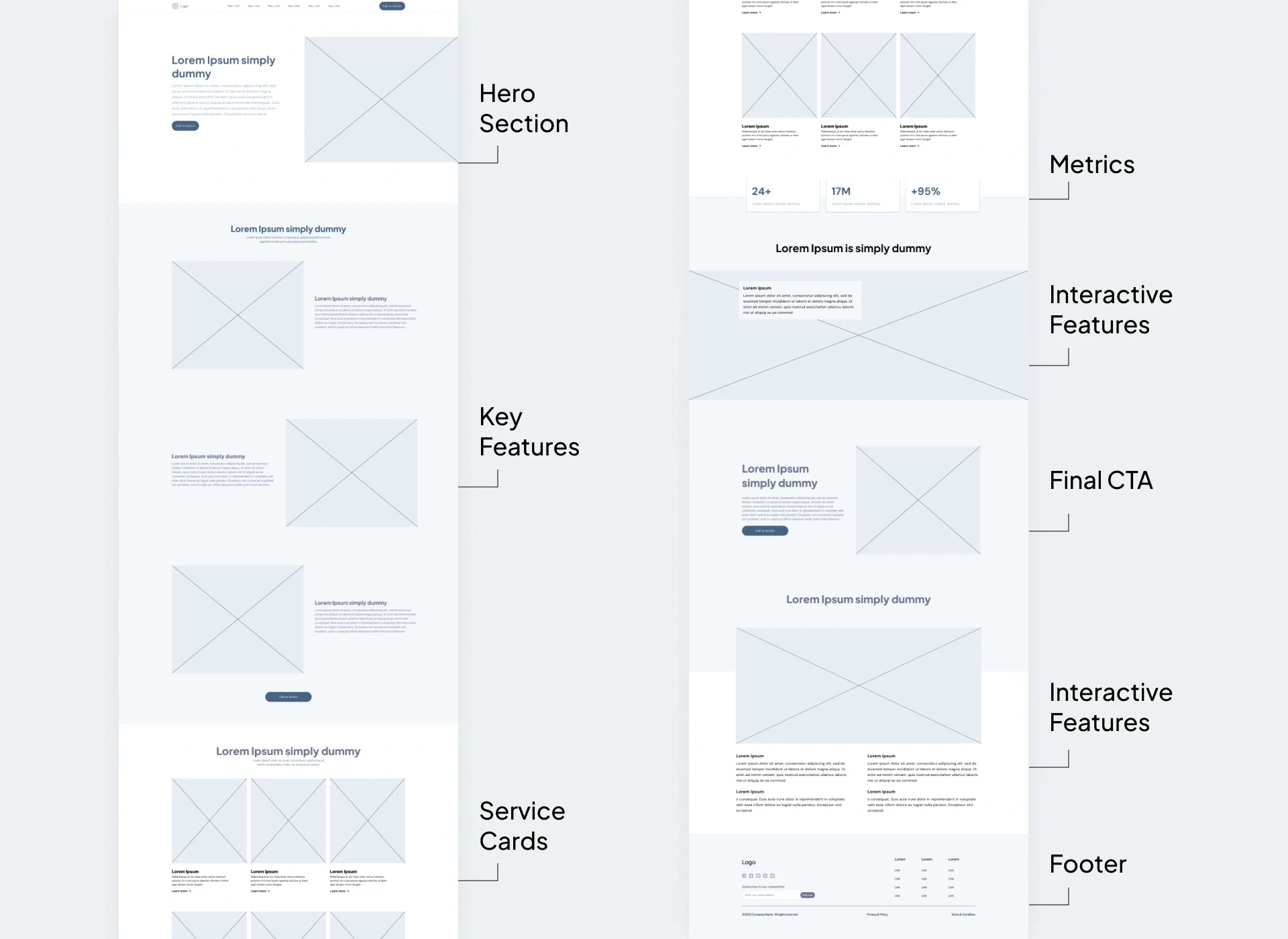


Wireframe with the initial layout of the page
Wireframe with the initial layout of the page
Visual
Exploration
I designed multiple versions of the homepage with a primary focus on showcasing the content in interactive and engaging ways. Finally, I developed 3 high-fidelity mockups to highlight the most effective solutions, demonstrating how the design elements integrate to form a cohesive and visually appealing experience.
Visual Exploration
I designed multiple versions of the homepage with a primary focus on showcasing the content in interactive and engaging ways. Finally, I developed 3 high-fidelity mockups to highlight the most effective solutions, demonstrating how the design elements integrate to form a cohesive and visually appealing experience.
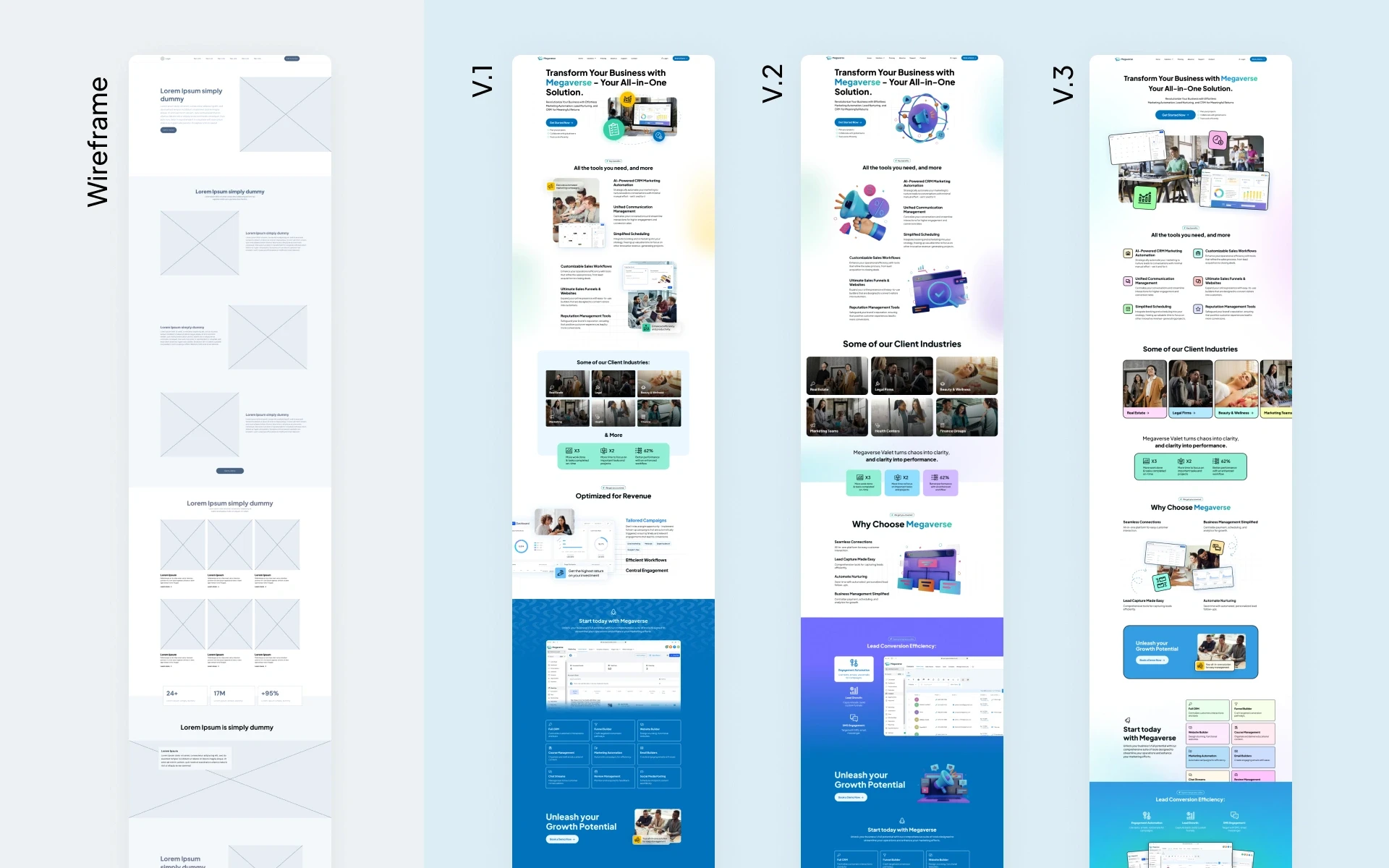


High-fidelity mockups from the visual exploration
High-fidelity mockups from the visual exploration
A joyful, yet professional visual style
V.1 showcased screenshots of the app combined seamlessly with icons and images of teamwork scenarios, looking for a meaningful way to engage the user's attention and interactively present all the important content. I used solid color and glass backgrounds on components as a way to enhance the readability of text over images and create visually appealing graphics.
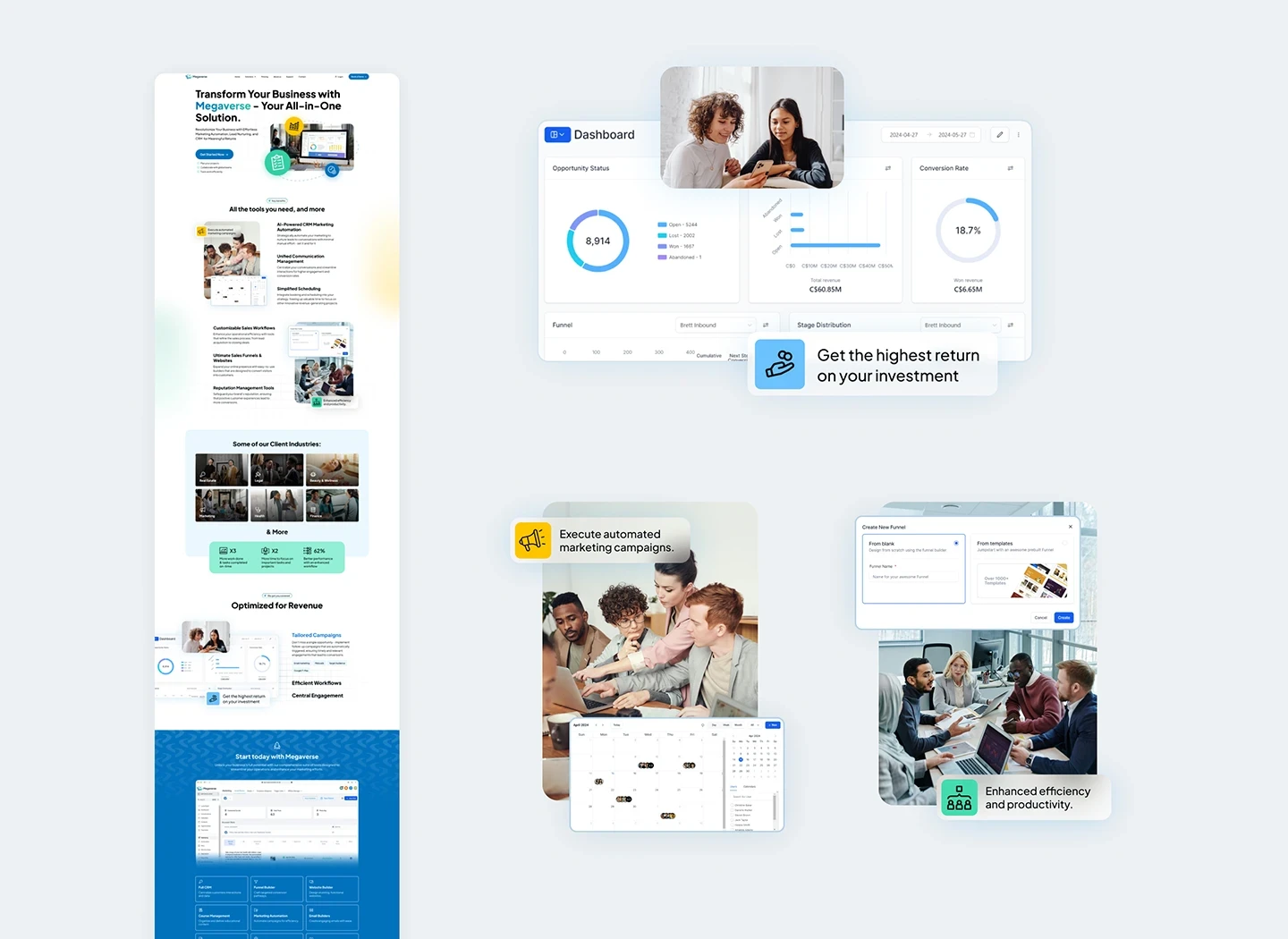


First variation of the homepage visual style
First variation of the homepage visual style
V.2 explored the use of 3D graphics elements as a way to support the content on the page. Even though it was functional it was not the optimal solution, but the clients specifically requested this and we made a variation following his inputs.
V.2 explored the use of 3D graphics elements as a way to support the content on the page. Even though it was functional it was not the optimal solution, but the clients specifically requested this and we made a variation following his inputs.
V.2 explored the use of 3D graphics elements as a way to support the content on the page. Even though it was functional it was not the optimal solution, but the clients specifically requested this and we made a variation following his inputs.
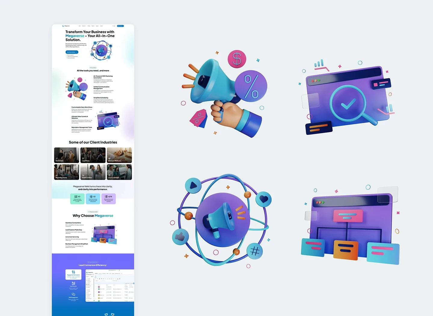


Second variation of the homepage visual style
Second variation of the homepage visual style
V.3 represented the colorful and refreshed branding of Megaverse. I followed the basics of Neubrutalism to create a set of colorful components with bold outlines to grab the user's attention and engagingly showcase the content. This would give Megaverse's site a distinctive appeal while keeping consistency with the new brand guidelines.
V.3 represented the colorful and refreshed branding of Megaverse. I followed the basics of Neubrutalism to create a set of colorful components with bold outlines to grab the user's attention and engagingly showcase the content. This would give Megaverse's site a distinctive appeal while keeping consistency with the new brand guidelines.
V.3 represented the colorful and refreshed branding of Megaverse. I followed the basics of Neubrutalism to create a set of colorful components with bold outlines to grab the user's attention and engagingly showcase the content. This would give Megaverse's site a distinctive appeal while keeping consistency with the new brand guidelines.
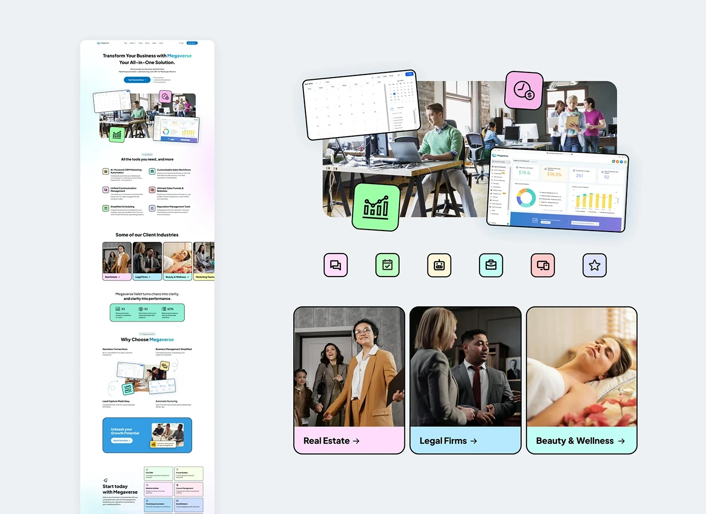


Third variation of the homepage visual style
Third variation of the homepage visual style
After sharing all the variations with the team we decided that the best course of action was to create a new version that could have the positive aspects of V1 & V3 and finally create a distinctive style for Megaverse that was not directly linked to a specific UI trend.
After sharing all the variations with the team we decided that the best course of action was to create a new version that could have the positive aspects of V1 & V3 and finally create a distinctive style for Megaverse that was not directly linked to a specific UI trend.
After sharing all the variations with the team we decided that the best course of action was to create a new version that could have the positive aspects of V1 & V3 and finally create a distinctive style for Megaverse that was not directly linked to a specific UI trend.
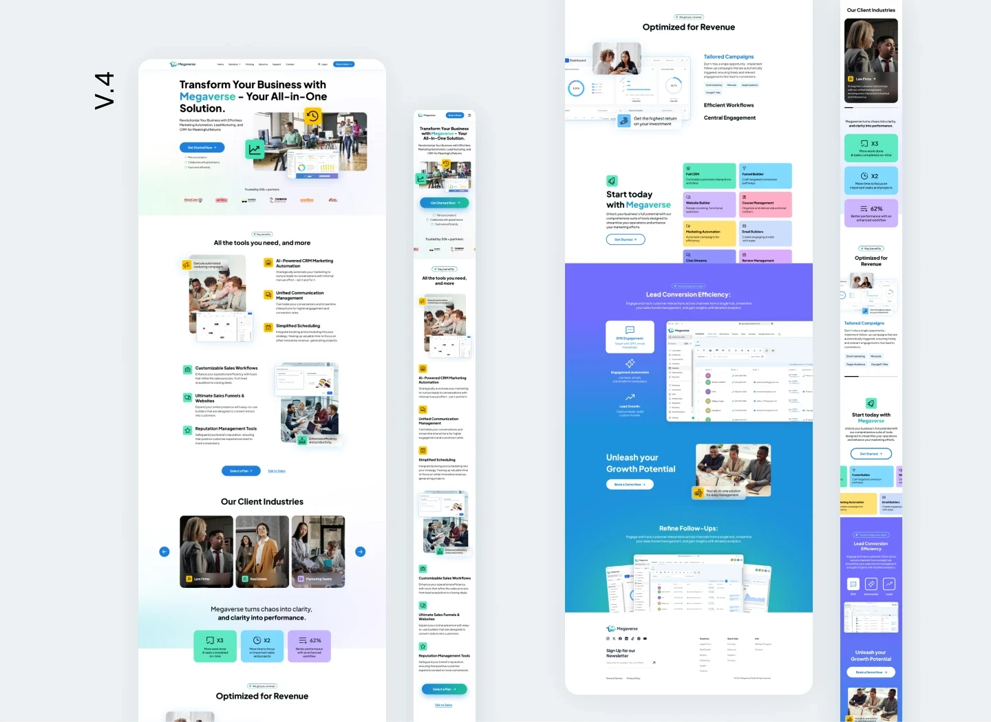


Final solution for the homepage design
Final solution for the homepage design
Final
Details
Iterating on the design solution
I made a second in-depth evaluation of the design solution alongside the stakeholders, and we decided to make 3 further changes to address issues regarding brand consistency and the client's input on some features:
At the start of the design process, we didn't include a social proof section on the wireframe because the company had no content related to the client's success stories, however at this stage of the design process this had changed, and we seized the opportunity to include such critical information on the design.
The hero section layout seemed unbalanced, so we decided to rearrange the elements on the page to make better use of the white space.
Even though purple was part of the brand color palette a purple-blue gradient was not, we decided to change it for the brand blue-green gradient and keep consistency with the brand guidelines
FINAL Details
Iterating on the design solution
I made a second in-depth evaluation of the design solution alongside the stakeholders, and we decided to make 3 further changes to address issues regarding brand consistency and the client's input on some features:
At the start of the design process, we didn't include a social proof section on the wireframe because the company had no content related to the client's success stories, however at this stage of the design process this had changed, and we seized the opportunity to include such critical information on the design.
The hero section layout seemed unbalanced, so we decided to rearrange the elements on the page to make better use of the white space.
Even though purple was part of the brand color palette a purple-blue gradient was not, we decided to change it for the brand blue-green gradient and keep consistency with the brand guidelines
Final Details
Iterating on the design solution
I made a second in-depth evaluation of the design solution alongside the stakeholders, and we decided to make 3 further changes to address issues regarding brand consistency and the client's input on some features:
At the start of the design process, we didn't include a social proof section on the wireframe because the company had no content related to the client's success stories, however at this stage of the design process this had changed, and we seized the opportunity to include such critical information on the design.
The hero section layout seemed unbalanced, so we decided to rearrange the elements on the page to make better use of the white space.
Even though purple was part of the brand color palette a purple-blue gradient was not, we decided to change it for the brand blue-green gradient and keep consistency with the brand guidelines
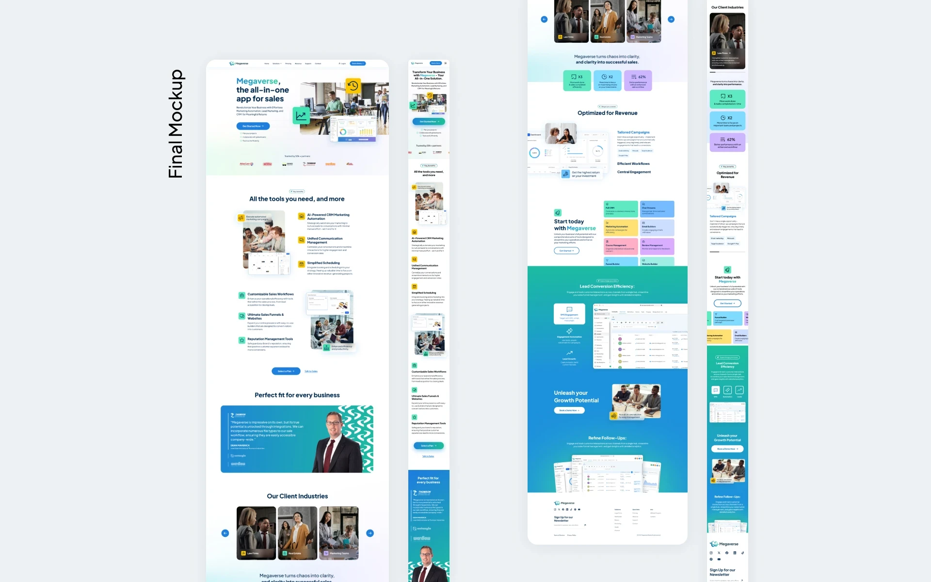


Iterations done to the final solution for better performance
Iterations done to the final solution for better performance
Prototype
Applications
Interactive
components
Finally, I used Figma to create an interactive prototype of the homepage, because even though we designed a single page, it had many interactive components, and it was important to have a visual representation of the specific behavior and functionality of each section to showcase the results to the different stakeholders.
Interactive components
Finally, I used Figma to create an interactive prototype of the homepage, because even though we designed a single page, it had many interactive components, and it was important to have a visual representation of the specific behavior and functionality of each section to showcase the results to the different stakeholders.
Prototype of the new homepage design
Prototype of the new homepage design
More Works More Works
More Works More Works
BRANDING
• UX/UI DESIGN
• ADVERTISING •
BRANDING
• UX/UI DESIGN
• ADVERTISING •
BRANDING
• UX/UI DESIGN
• ADVERTISING •
BRANDING
• UX/UI DESIGN
• ADVERTISING •
BRANDING
• UX/UI DESIGN
• ADVERTISING •

