megaverse Crm
This is a detailed case study about the creative process towards developing a new brand identity for Megaverse Valet, a SaaS Startup in Canada that wanted to reintroduce itself to the industry to accurately reflect the company’s updated scale and value proposition. To see the final solution directly use this link.
Client
Megaverse
Year
2024
Category
Brand Identity, Logo
industry
Startup, saas
QUICK SUMMARY
KEY RESPONSIBILITIES
Leading the brand redesign process alongside the brand strategist.
Collaborating closely with the rest of the team to ensure our creative visions were brought to life.
Creating a new logo, branding guidelines, media assets for a marketing campaign and a new home / landing page design.
Leading the brand redesign process alongside the brand strategist.
Collaborating closely with the rest of the team to ensure our creative visions were brought to life.
Creating a new logo, branding guidelines, media assets for a marketing campaign and a new home / landing page design.
DURATION
March 2024 - May 2024
March 2024 - May 2024
role
Brand Designer
Logo Designer
Graphic Designer
Brand Designer
Logo Designer
Graphic Designer
TEAM
1 x
1 x
1 x
1 x
1 x
1 x
1 x
1 x
1 x
1 x
Project Manager
Brand Strategist
Brand Designer (Me)
Junior Designer
Ad Specialist
Project Manager
Brand Strategist
Brand Designer (Me)
Junior Designer
Ad Specialist
KEY RESPONSIBILITIES
Leading the brand redesign process alongside the brand strategist.
Collaborating closely with the rest of the team to ensure our creative visions were brought to life.
Creating a new logo, branding guidelines, media assets for a marketing campaign and a new home / landing page design.
DURATION
March 2024 - May 2024
role
Brand Designer
Logo Designer
Graphic Designer
TEAM
1 x
1 x
1 x
1 x
1 x
Project Manager
Brand Strategist
Brand Designer (Me)
Junior Designer
Ad Specialist
KEY RESPONSIBILITIES
Leading the brand redesign process alongside the brand strategist.
Collaborating closely with the rest of the team to ensure our creative visions were brought to life.
Creating a new logo, branding guidelines, media assets for a marketing campaign and a new home / landing page design.
DURATION
March 2024 -
May 2024
role
Brand Designer
Logo Designer
Graphic Designer
TEAM
1 x
1 x
1 x
1 x
1 x
Project Manager
Brand Strategist
Brand Designer (Me)
Junior Designer
Ad Specialist
DISCOVERY
DISCOVERY
DESIGN BRIEF
We started the project by giving the Megaverse team a worksheet with short-answer questions and clickable multiple-choice options. It’s an efficient way to get to know the brand, and the exercises help the client give language to aspects of their business they might not have articulated before. The answers serve as a creative brief we can refer back to during the brand creation process.
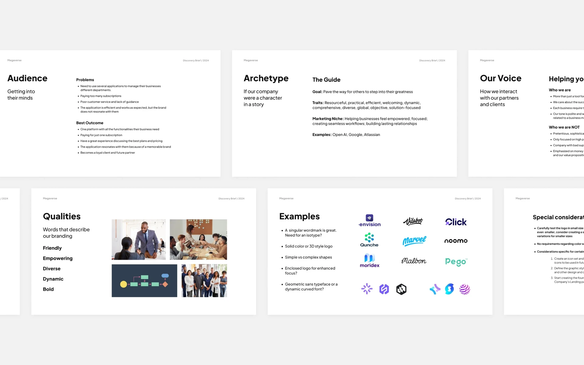


Design Brief to support the discovery and design process
Design Brief to support the discovery and design process
After a follow-up session with the client and stakeholders, we rounded up the requirements and goals for the creation of a new logo and brand strategy: we needed a symbol that could communicate the friendly and empowering nature of the company while being scalable and abstract enough to support the current and future expansion processes.
After a follow-up session with the client and stakeholders, we rounded up the requirements and goals for the creation of a new logo and brand strategy: we needed a symbol that could communicate the friendly and empowering nature of the company while being scalable and abstract enough to support the current and future expansion processes.
After a follow-up session with the client and stakeholders, we rounded up the requirements and goals for the creation of a new logo and brand strategy: we needed a symbol that could communicate the friendly and empowering nature of the company while being scalable and abstract enough to support the current and future expansion processes.
DESIGN
Concepts
Exploring Many Paths…
There was a lot of process and critique time with the Megaverse logo. Capturing the correct mood and feel for a startup dedicated to helping other businesses on their way to success requires a lot of insight.
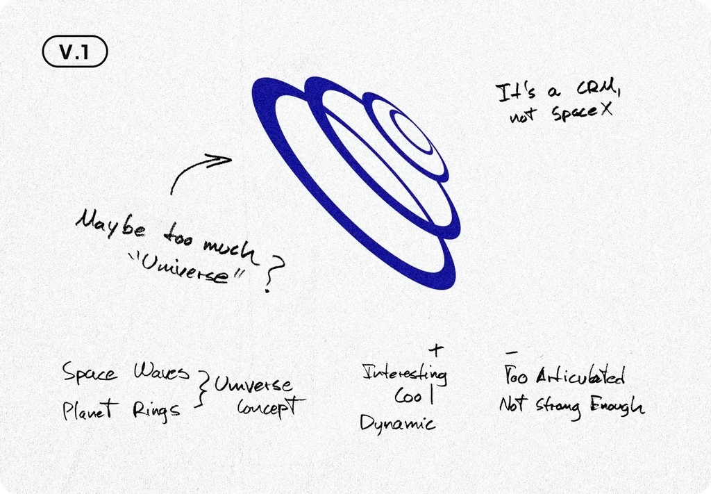
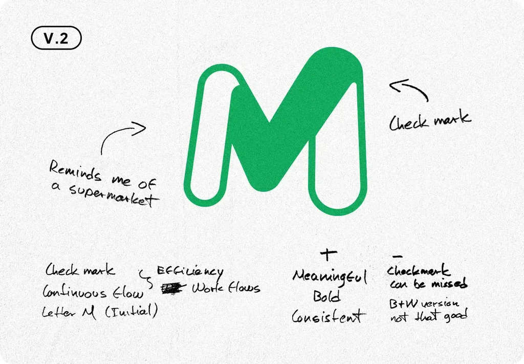
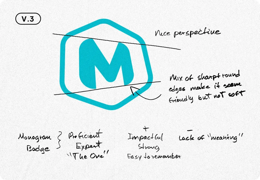
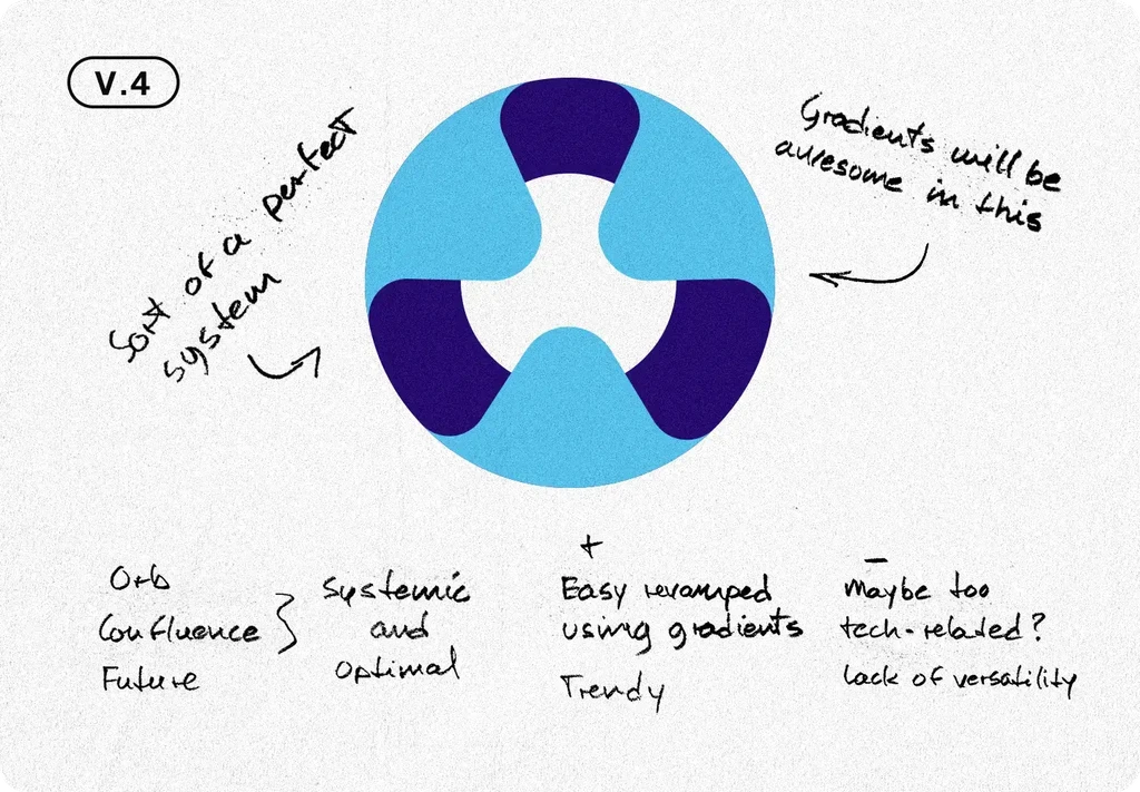
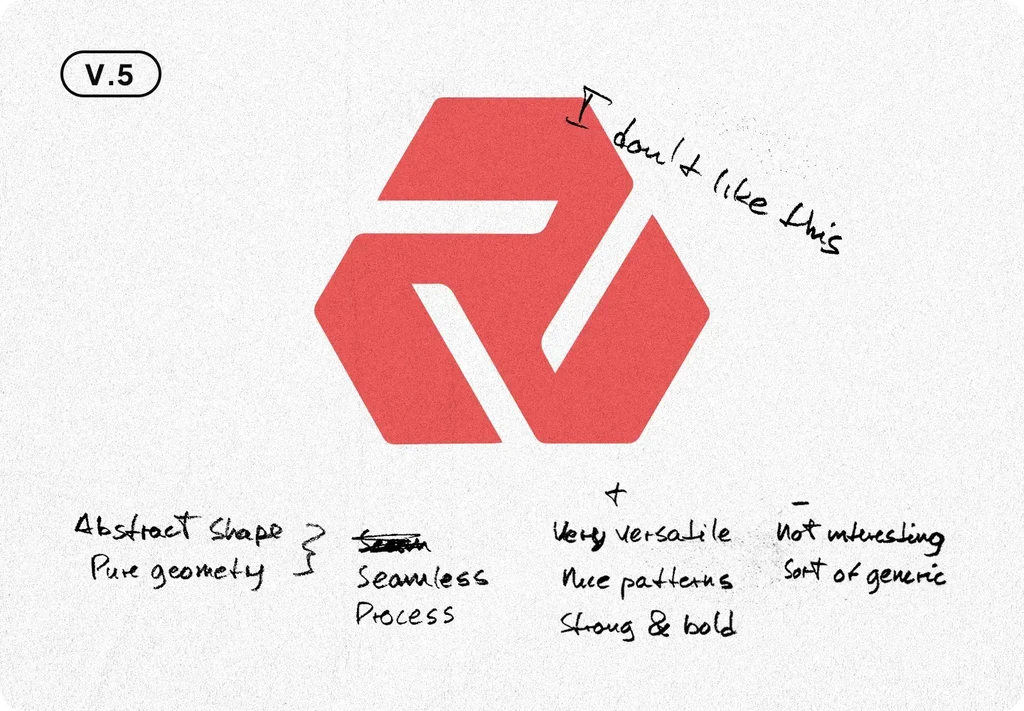
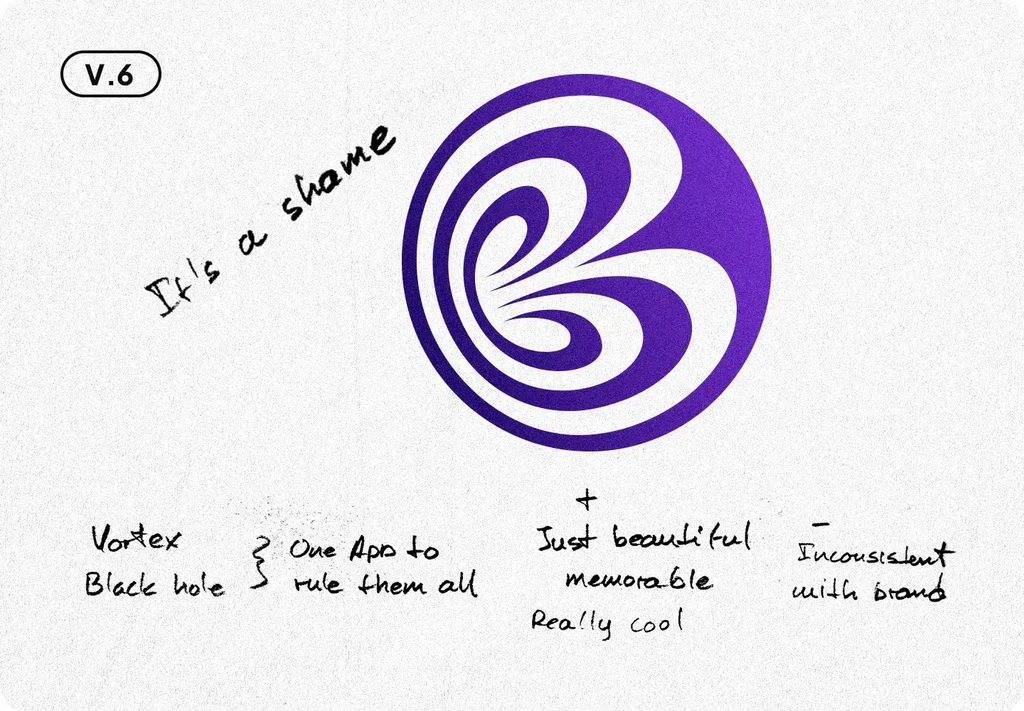
The ideation and brainstorming began with mind mapping and quick sketches. I went through a lot of different concepts alongside our junior designer, going from the universe concept to monograms, workflow management, and a couple of other crazy ideas. Finally, we had 6 solid options with shapes and reference-only colors, to decide the final concept to work with and turn into a fully functional logo.
Initial exploration of concepts for the logo design
From the initial concepts, our team wanted to keep working with V.1, while the client chose V.3 because the initial letter idea was easily scalable and very versatile. We decided to keep working and come up with a new, stronger concept that could mix both version.
From the initial concepts, our team wanted to keep working with V.1, while the client chose V.3 because the initial letter idea was easily scalable and very versatile. We decided to keep working and come up with a new, stronger concept that could mix both version.
From the initial concepts, our team wanted to keep working with V.1, while the client chose V.3 because the initial letter idea was easily scalable and very versatile. We decided to keep working and come up with a new, stronger concept that could mix both version.
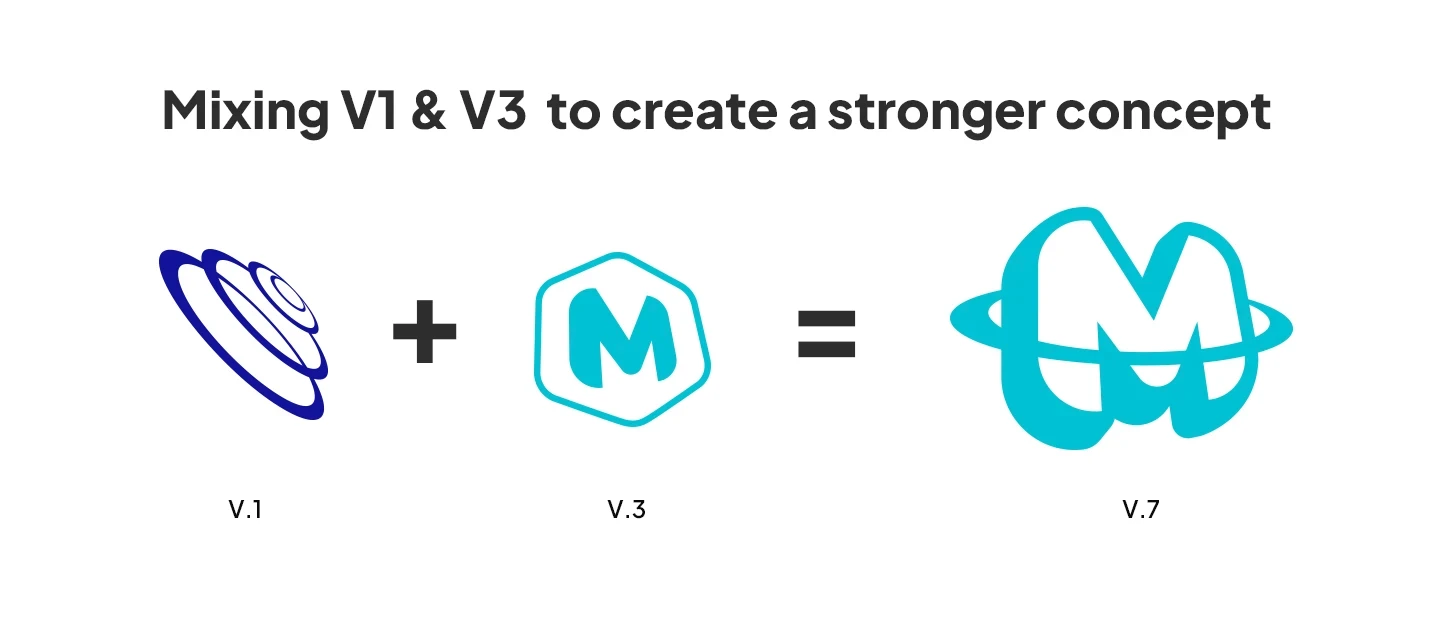


Mixing different concepts to create a new one
Mixing different concepts to create a new one
FINAL
COncept
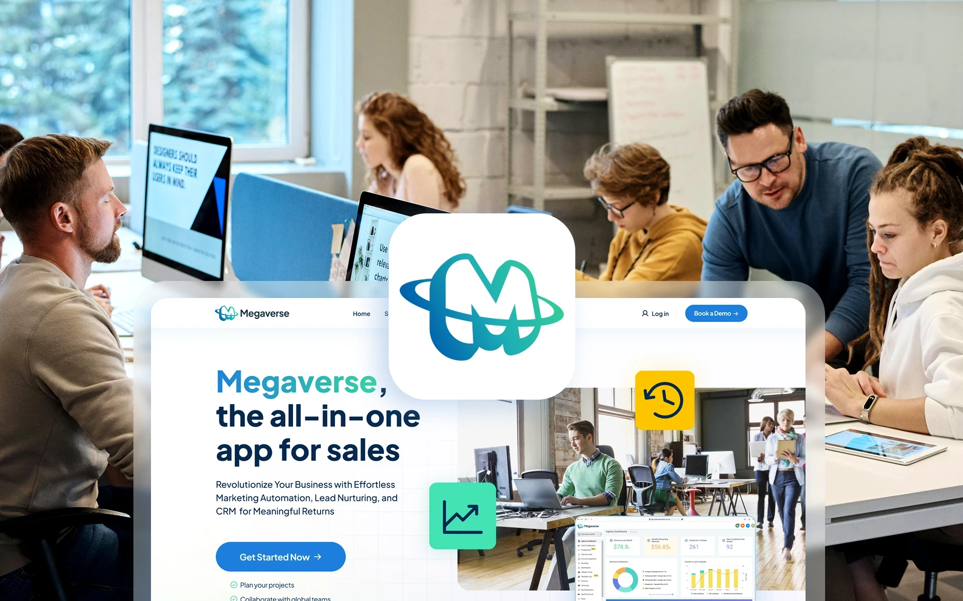
With the final concept, we achieve the goal of representing the friendly and supportive nature of the company through the use of round shapes, which are proven to send a positive emotional message of commitment, protection, and flow.
Using a subtle perspective and extruding the letter we communicate a sense of power and success, we are a bold brand and we are here to help you grow and achieve your full potential.
The singularity and memorability aspects are ensured with a customized, designed-from-scratch letter M and the planetary ring add-on to provide a deeper connection with the company's name: Mega-verse.
FINAL COncept
With the final concept, we achieve the goal of representing the friendly and supportive nature of the company through the use of round shapes, which are proven to send a positive emotional message of commitment, protection, and flow.
Using a subtle perspective and extruding the letter we communicate a sense of power and success, we are a bold brand and we are here to help you grow and achieve your full potential.
The singularity and memorability aspects are ensured with a customized, designed-from-scratch letter M and the planetary ring add-on to provide a deeper connection with the company's name: Mega-verse.
REFINEMENT
Done with the creative process. Start with the design work.
Having a clearly defined logo concept it was time to dwell into the polishing process of the symbol until we could determine that the isotype was optimal and fully functional for both physical and digital spaces, and all the applications needed.
The overall shape of the symbol was nearly perfect, only small edits regarding the round corners' radius were needed. However, the ring seemed a little stiff in the design. Was only one ring enough? What if we could rotate it to merge seamlessly with the extruded letter's perspective?
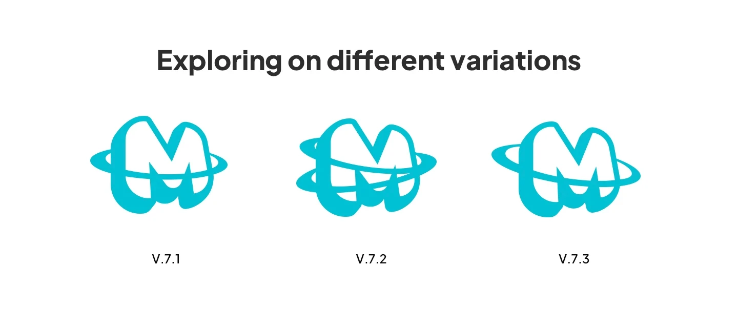


Exploring on different variations of the ring element
Exploring on different variations of the ring element
We had a better composition with V.7.3, the resulting increased white space was an improvement regarding the logo's performance in small sizes, and the sense of movement and flow added value to the new branding.
Next, we had to test the symbol's volume and boldness to discover the best value so it could work for both a large-scale street banner and a website favicon.
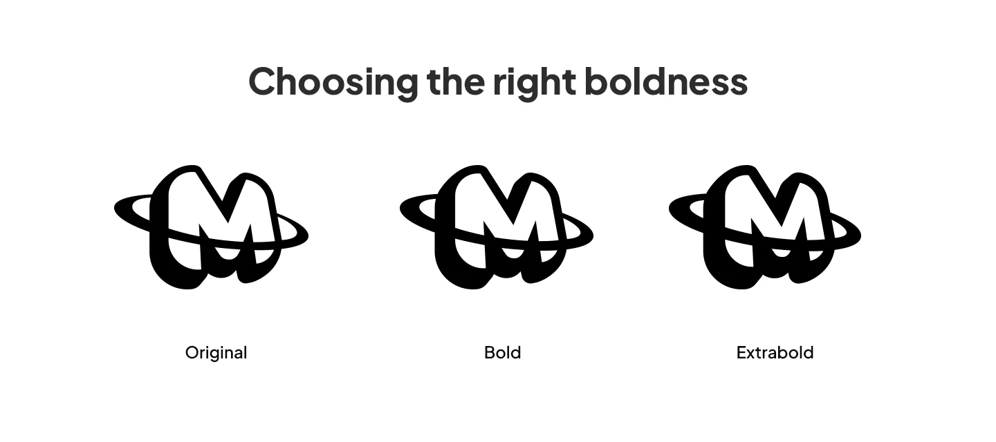


Testing different boldness levels for the logo
Testing different boldness levels for the logo
Since the symbol is based on an outlined element, testing the line's thickness is core to ensure an optimal performance, we explored thinner values but they took away much of the cool and impactful sense of the isotype, so we decided to only test bolder variations.
After careful consideration, we kept the original volume since it had just the right amount of balance between black & white space. The bolder versions were good-looking but they started to have performance issues when displayed at 32px and we required optimal performance on as little as 16px. We decided it was not worth it to have multiple values of boldness for this reason.
Color &
Wordmark
When all the necessary edits and iterations on the symbol design were done, it was time to start exploring different combinations of color and typography for the wordmark. We decided to look for a regular sans-serif typeface that could have good synergy with the isotype and avoid making any changes on it so the symbol could be the main point of focus.
To identify potential areas for improvement, I conducted a competitive analysis of 7 important Law Firm websites in the Markham and Toronto area, before beginning the discovery and design phase. By taking screenshots and noting common features, I was able to observe how competitors solve similar problems. By interacting with the websites, I also evaluated potential areas for improvement and feature changes.
Color & Wordmark
When all the necessary edits and iterations on the symbol design were done, it was time to start exploring different combinations of color and typography for the wordmark. We decided to look for a regular sans-serif typeface that could have good synergy with the isotype and avoid making any changes on it so the symbol could be the main point of focus.
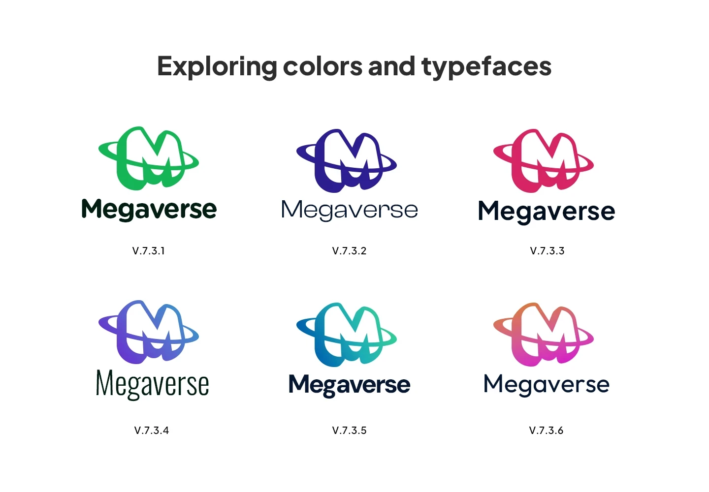


Exploration for the color and typography to use
Exploration for the color and typography to use
We tried a wide range of different color and gradient combinations and finally rounded all options to the 6 most according to the new brand strategy. The client wanted to use red because of the great impact it had but we suggested the blue-green gradient version as the way to go because of the positive connotation of these colors towards technology, empathy, and protection.
We tried a wide range of different color and gradient combinations and finally rounded all options to the 6 most according to the new brand strategy. The client wanted to use red because of the great impact it had but we suggested the blue-green gradient version as the way to go because of the positive connotation of these colors towards technology, empathy, and protection.
We tried a wide range of different color and gradient combinations and finally rounded all options to the 6 most according to the new brand strategy. The client wanted to use red because of the great impact it had but we suggested the blue-green gradient version as the way to go because of the positive connotation of these colors towards technology, empathy, and protection.
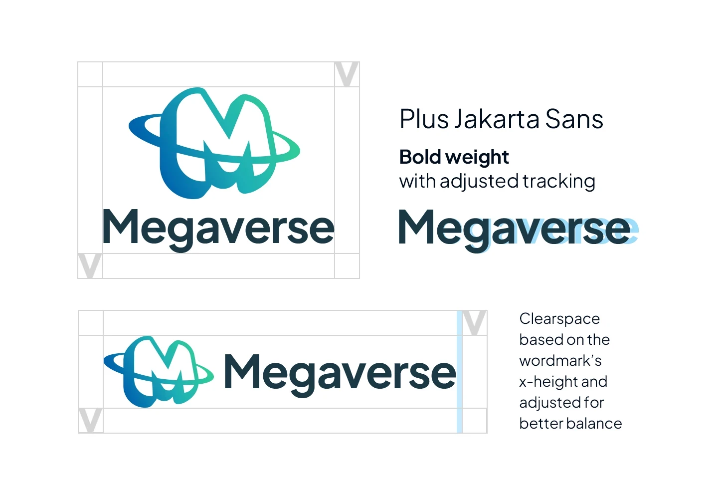


Final logo with clearspace and typography selection
Final logo with clearspace and typography selection
We chose Plus Jakarta Sans as the wordmark and brand primary typography. A modern geometric sans serif with almost monolinear contrast, pointy curves, and clean-cut forms. The x-height dimension is slightly taller to provide clear spaces, and it's also equipped with open counters and balanced spaces to preserve legibility at a large range of sizes.
We chose Plus Jakarta Sans as the wordmark and brand primary typography. A modern geometric sans serif with almost monolinear contrast, pointy curves, and clean-cut forms. The x-height dimension is slightly taller to provide clear spaces, and it's also equipped with open counters and balanced spaces to preserve legibility at a large range of sizes.
We chose Plus Jakarta Sans as the wordmark and brand primary typography. A modern geometric sans serif with almost monolinear contrast, pointy curves, and clean-cut forms. The x-height dimension is slightly taller to provide clear spaces, and it's also equipped with open counters and balanced spaces to preserve legibility at a large range of sizes.
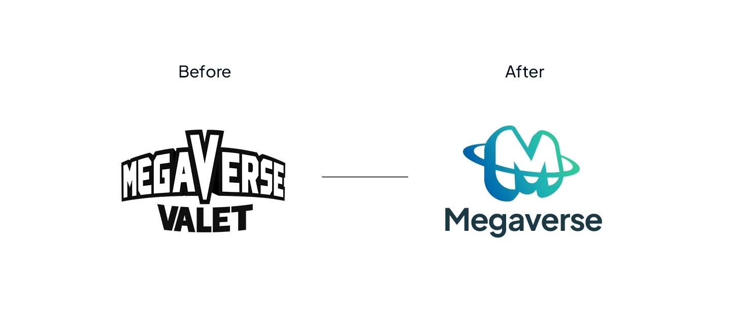


Comparison between the older logo and the redesign
Comparison between the older logo and the redesign
Visual Identity
Applications
Brand book
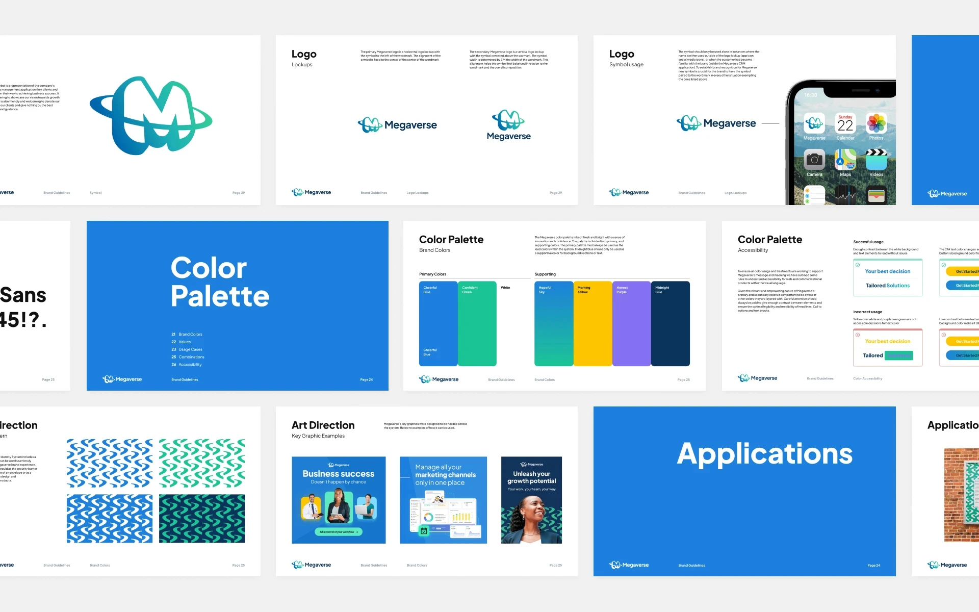
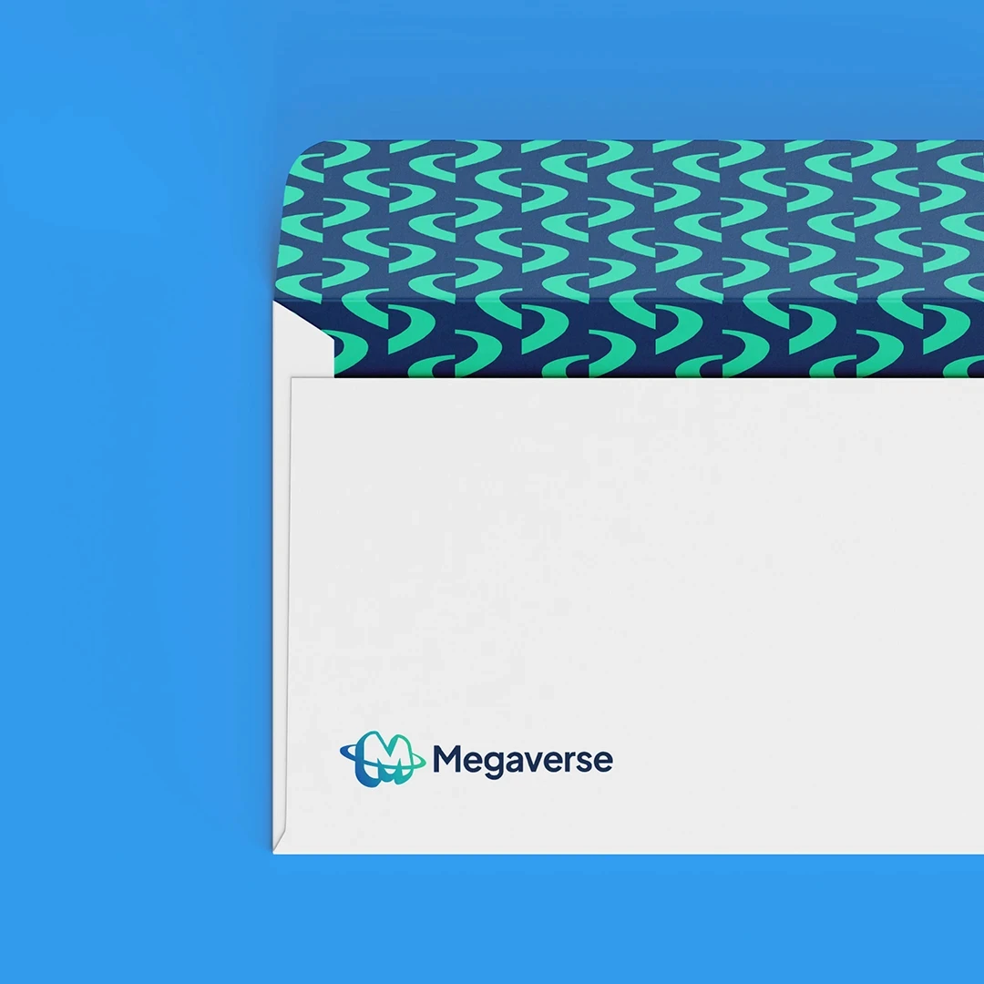
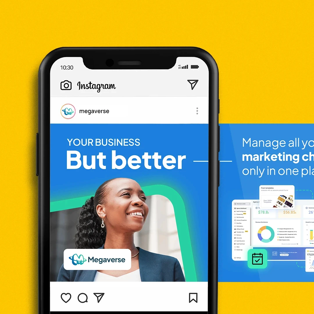
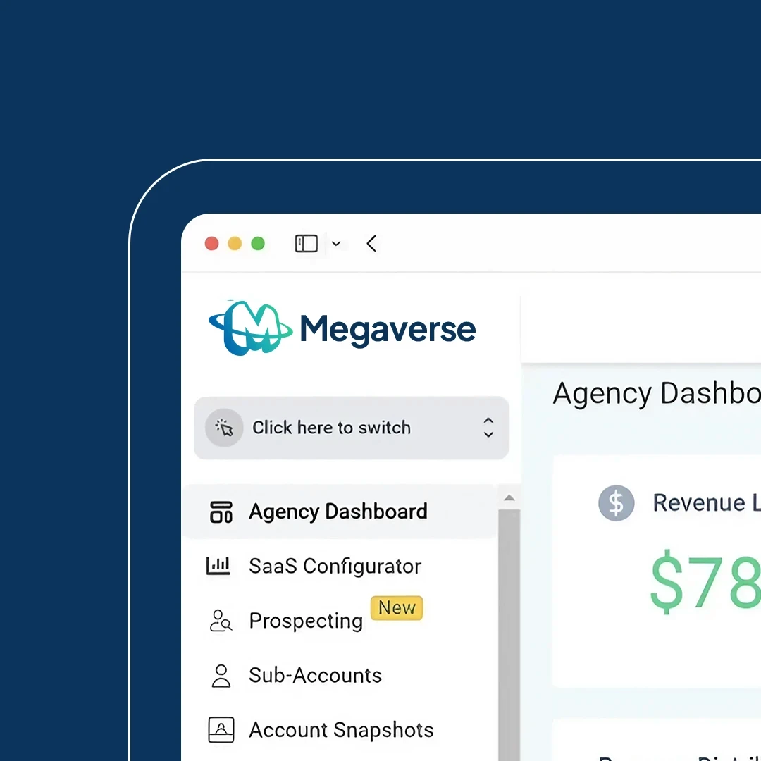
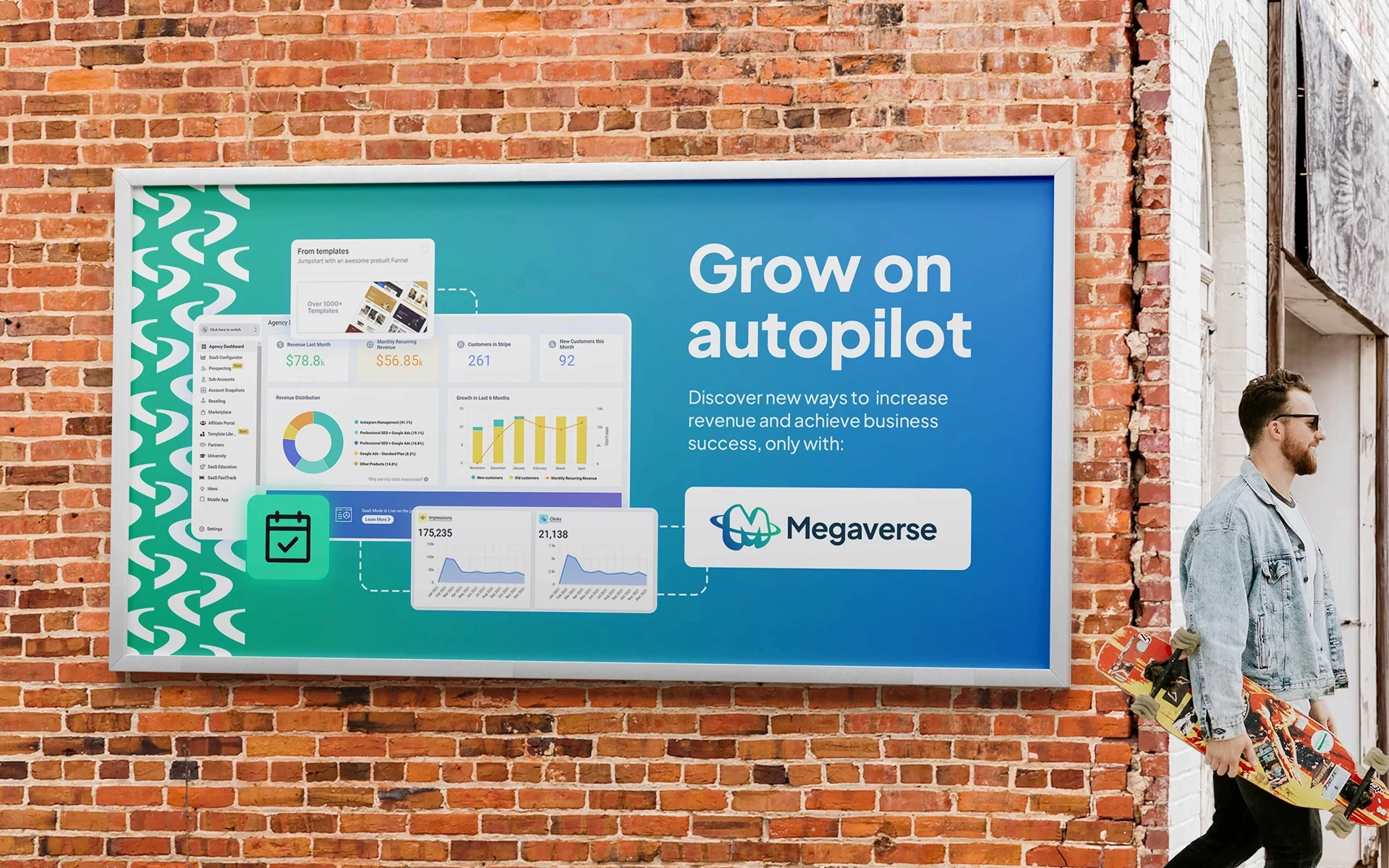
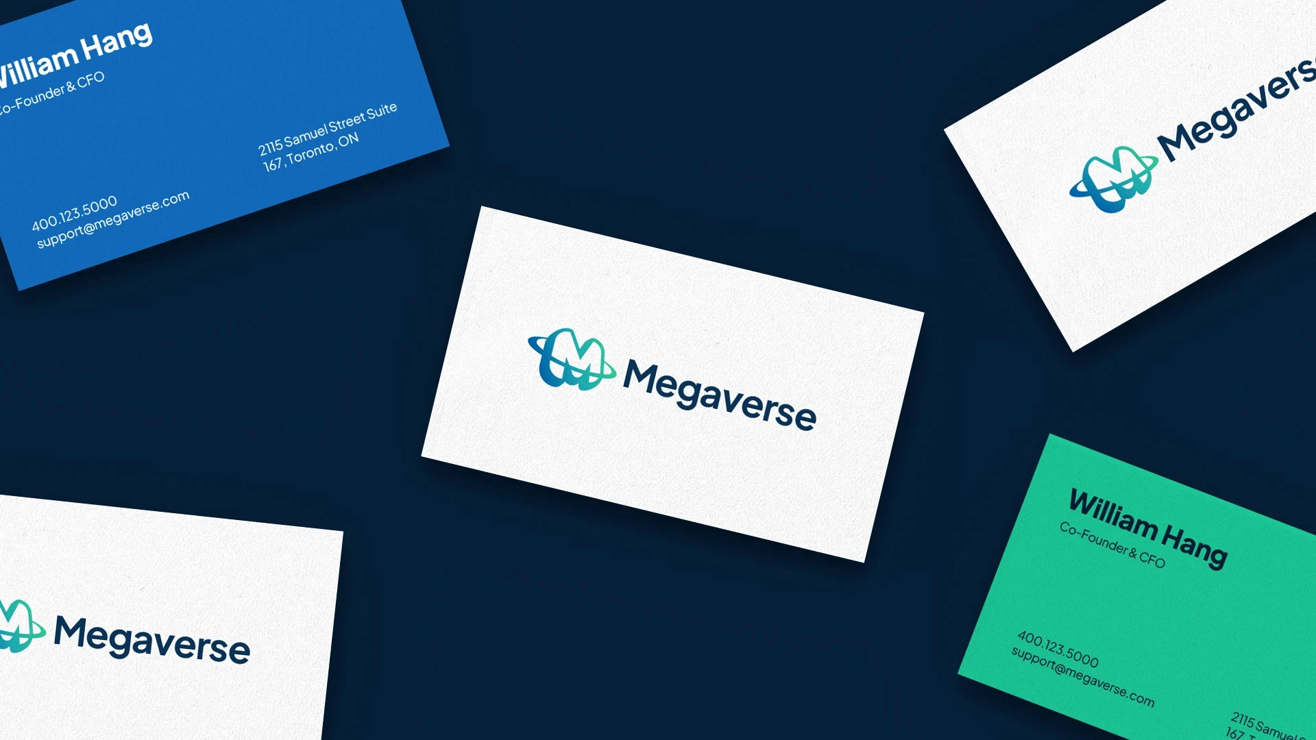
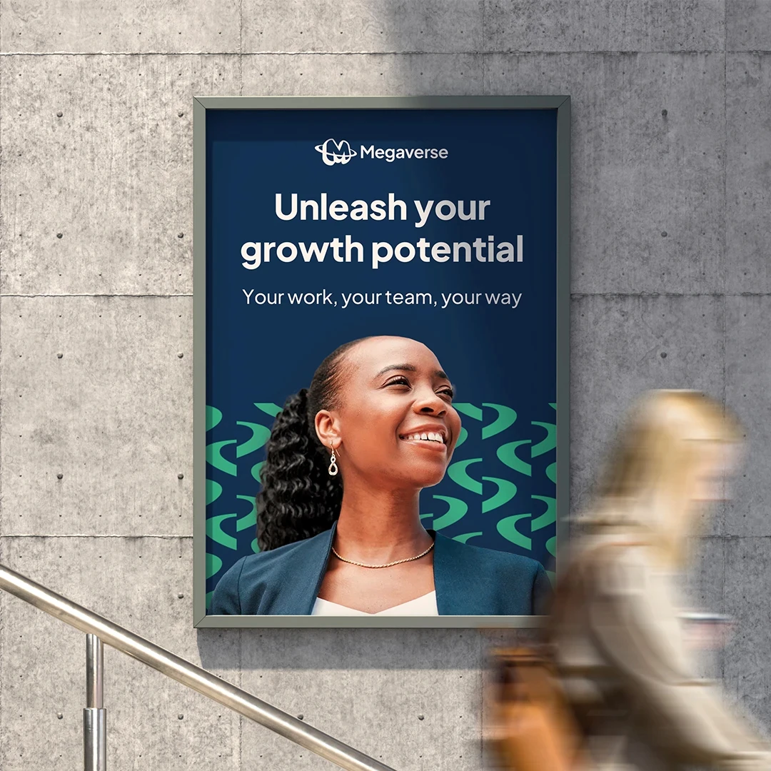
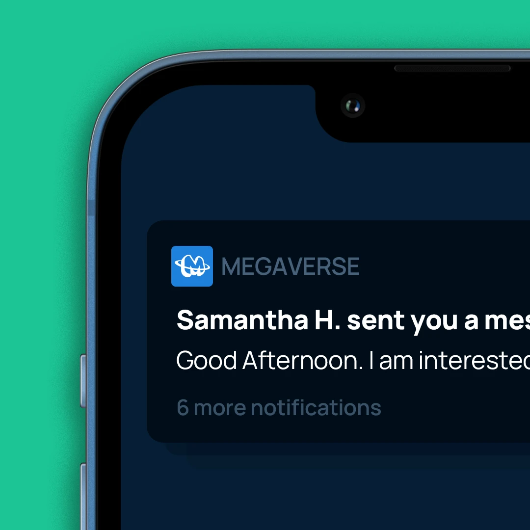
From marketing platforms to internal products, Megaverse’s identity needed to work within a wide variety of different mediums found within their company’s marketing and product ecosystem. The visual identity consists of a fresh and vibrant color palette, simple typography, and a design language that allows the team to create with ease internal and external communicational products.












Landing
Page
Due to the length of this case study the whole process for creating a new landing page design for the Megaverse brand is showcased on a separate page. To continue reading about my work with the Megaverse company use this link or the card at the end of the page.
Lading Page
Due to the length of this case study the whole process for creating a new landing page design for the Megaverse brand is showcased on a separate page. To continue reading about my work with the Megaverse company use this link or the card at the end of the page.
Landing page
Due to the length of this case study the whole process for creating a new landing page design for the Megaverse brand is showcased on a separate page. To continue reading about my work with the Megaverse company use this link or the card at the end of the page.
More Works More Works
More Works More Works
BRANDING
• UX/UI DESIGN
• ADVERTISING •
BRANDING
• UX/UI DESIGN
• ADVERTISING •
BRANDING
• UX/UI DESIGN
• ADVERTISING •
BRANDING
• UX/UI DESIGN
• ADVERTISING •
BRANDING
• UX/UI DESIGN
• ADVERTISING •

